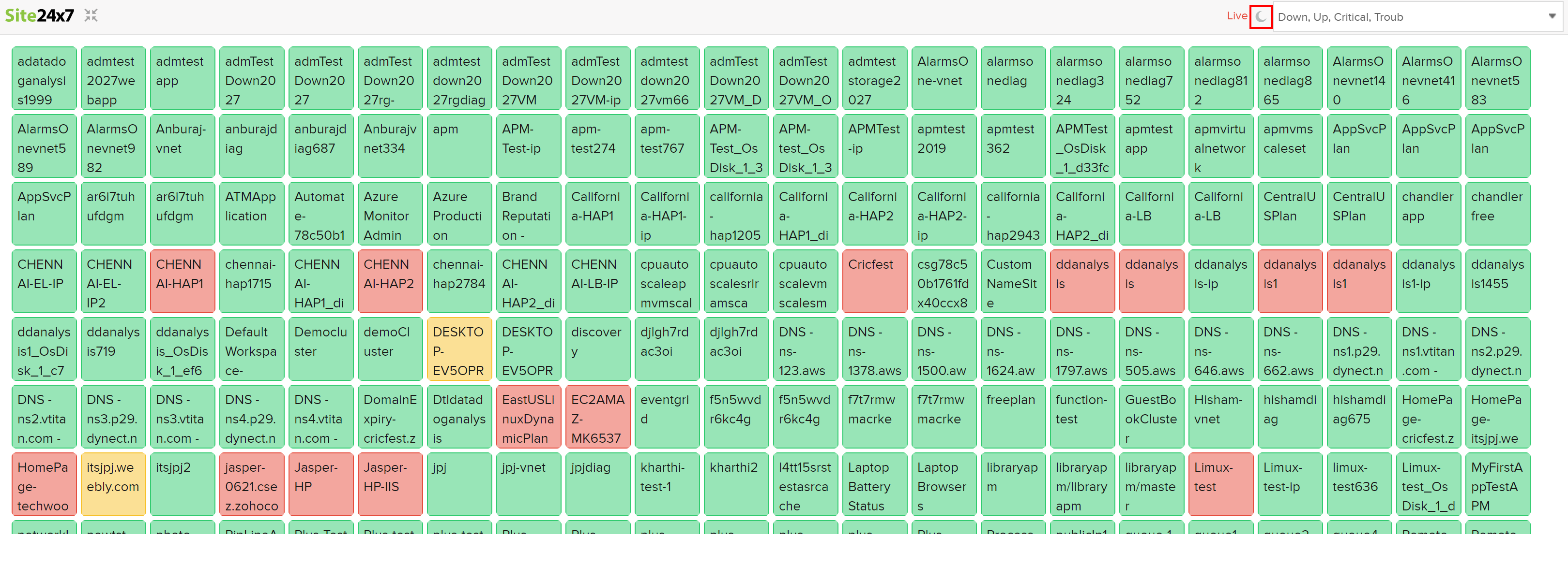
I am seeing inconsistencies in depth of colour of monitor status for various dashboards. For example the colour of monitors that shows all of my monitors (attachment everything) is much darker compared to colour of the status of monitor groups (attachment status_group.png or down_all.png) in another dashboard, which is much lighter. Not sure if its because of the size of the tiles. But this needs to be fixed, otherwise its confusing, specifically so when I am presenting these dashboards to my non ICT business users. Consistent colour depth required all colours i.e. green, amber and red irrespective of the what is the size of the tile or which type of dashboard I am using.
Hey Ash,
The different status colors (infact the day theme status colors are the same with lesser opacity) are used for Day theme and Night theme. Some customers prefer a darker theme and some a lighter theme and hence the status of the monitors are based on this theme. I believe you have set one dashboard as day and another as night and hence the different in the shade of colors. You can toggle between them using the sun/moon icon at the top right.
Day Mode

Night Mode

-Jasper
Product Manager, Site24x7
Hi There,
Not sure what you mean by "convert all navigation to dark mode". Any explanation would be helpful. Are you asking for the whole UI to support dark mode?
-Jasper
Product Manager, Site24x7