Custom Dashboard
Our Custom Dashboard brings together essential metrics from all levels of your infrastructure into one customizable view, enabling you to monitor KPIs at a glance. It features dynamic widgets that adapt to various devices and can be easily shared with colleagues and clients via permalinks, iframes, or exported PDFs. By adding widgets that highlight key metrics, you can tailor your monitoring experience for improved insights and efficiency. This document explains how to create and customize a dashboard to optimize your monitoring capabilities.
How to create a new Custom Dashboard
- Go to Home > Dashboard > Create new.
- In the Dashboard page, from the tool bar, you can perform the following actions:
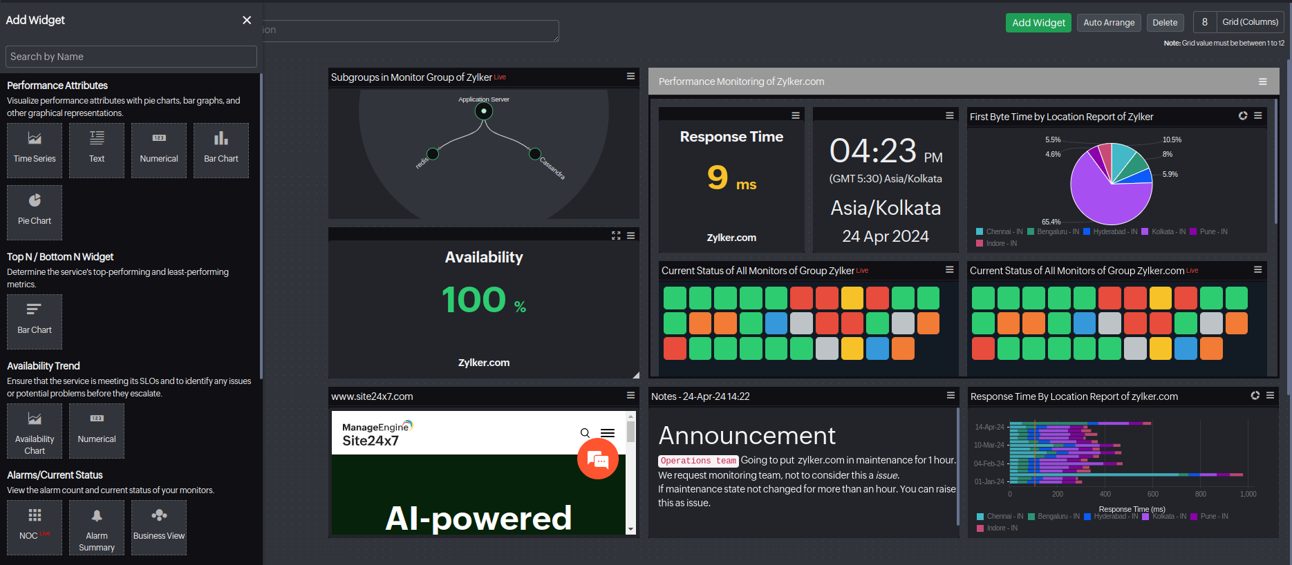
- Click Add Widget to add the widgets you want from the left panel.
- Once you add the widgets, click Auto Arrange to optimize the dashboard's layout.
- You can Delete the dashboard.
- You can edit the grid (i.e., columns) to meet your needs.
- Click Done Customizing once you're done customizing your dashboard.
Now, to view your customized dashboard, go to the Dashboards page and click the Custom Dashboards tab. Choose the desired dashboard, and from here, you can perform the following functions from the top band:
- Click the Edit Dashboard option to edit your dashboard.
- Click the Filter icon to filter the widget by the desired widget name.
- Set the selected dashboard as the landing page by clicking the Landing Page button.
- View data in its raw form or aggregated on an hourly basis to better analyze trends and patterns over different time periods by using the Raw/Hour toggle.
If you choose the widget's level period as Last 7 days, you can choose from Raw, Hour, or Day.
- Choose the Widget Level Period you want from the drop-down menu. This feature is applicable for supported widgets.
- Click Share As to share the dashboard. You can choose to export the dashboard as PDF, schedule the dashboard during your desired time, click Make Public to expand your dashboard's access without mandating login credentials or use Share With option to send data directly to third-party tools.
- When you choose the Make Public option, you must complete the Share Dashboard form. This allows you to:
- View the permalink.
- Embed the dashboard as an iframe in your website.
- Use the Enable Dark Theme toggle (applicable for the dashboard you want to make public).
- Use the Restrict IP Address toggle to control access of the public dashboard based on the IP range you provide.
- After making your selections, click Save. You can also click Unshare Dashboard at the bottom-right of the screen to unshare the dashboard.
- The Share With option is available only when a third-party integration has been enabled for the selected tools.
- Third-party tool: Choose the third-party tools you want to send the report to.
- Message header: A default message header is provided. Modify it as needed to change how the header appears in the message notification.
- This option is available for integration tools such as Slack, Telegram, and Discord.
- To verify whether the data has been successfully sent to the third-party tool, check the Logs page. This displays the status of each request and helps you confirm whether the data transmission was successful or if any errors occurred.
How to add widgets
Explore the available widgets and follow the steps to add them to your dashboard.
Performance Attributes
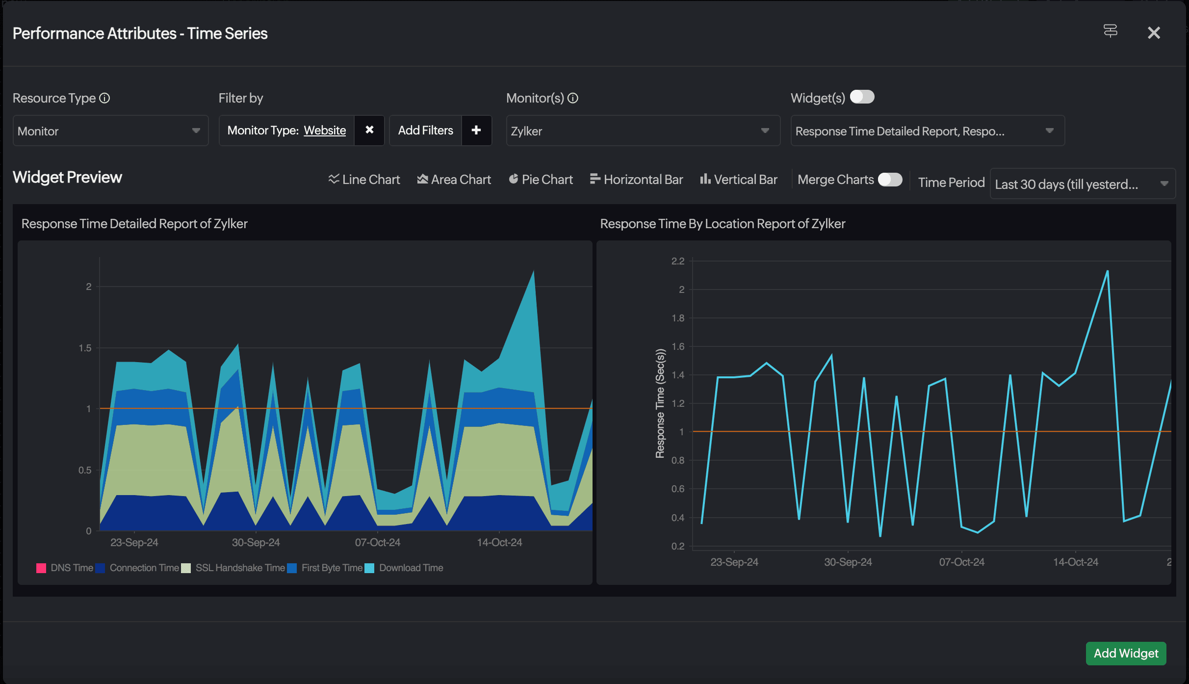
Time Series
The Time Series Widget provides data visualization of performance metrics over specific time intervals. This widget is particularly useful for tracking and analyzing the historical performance of resources, allowing users to observe trends, patterns, and anomalies over time. You can choose to view the data as a line chart, area chart, pie chart, vertical bar, or horizontal bar.
- Resource Type: Choose Monitor, Monitor Group, Tags, Child Entity, or On-Premise Pollers.
NoteTo display the On-Premise Poller Health Dashboard in your widgets, select On-Premise Pollers in the Resource Type field.
- Monitor(s): Choose a desired monitor.
- Filter by: Filter the resources based on the Monitor Type, Monitor Groups, and Tags.
- Widget(s): This option offers a selection of predefined charts that you can easily add as widgets to your dashboard. Alternatively, you can toggle the button to customize your own charts by selecting attributes. The toggle button is automatically enabled for Monitor Group, allowing for seamless customization.
NoteYou can select multiple steps from the Steps drop-down and create a widget based on the step time. The Step Time widget is available only for Web Transaction (Browser) and Synthetic Mobile Application monitors, as these monitor types support multiple steps. This helps isolate performance issues by tracking the duration of each step in the workflow, making it easier to pinpoint slow steps and enhance user experience.
- Show: When selecting Monitor Group (in this case, if you select a predefined chart), or Tags, simply pick the desired tags to view the latest 50 active monitors. Opt for Monitor Group to display the following widgets: Latest 50 Active Monitors, Top 50 Monitors, and Bottom 50 Monitors.
- Child Entity Type: Select the desired Child Entity Type from the drop-down menu to view the associated Child Entities. This field is displayed only for selected monitor type and lists the Child Entity Type available.
- Filter by: The Filter by drop-down menu adjacent to the Child Entities allows you to filter the child entities based on the Child Tag(s).
- Child Entities: Select the Child Entities associated with the chosen Child Entity Type from the drop-down menu.
- Merge Charts: Merge the charts of different resources or attributes you have selected for comparison of data.
- Time Period: Choose the desired time period to view your data.
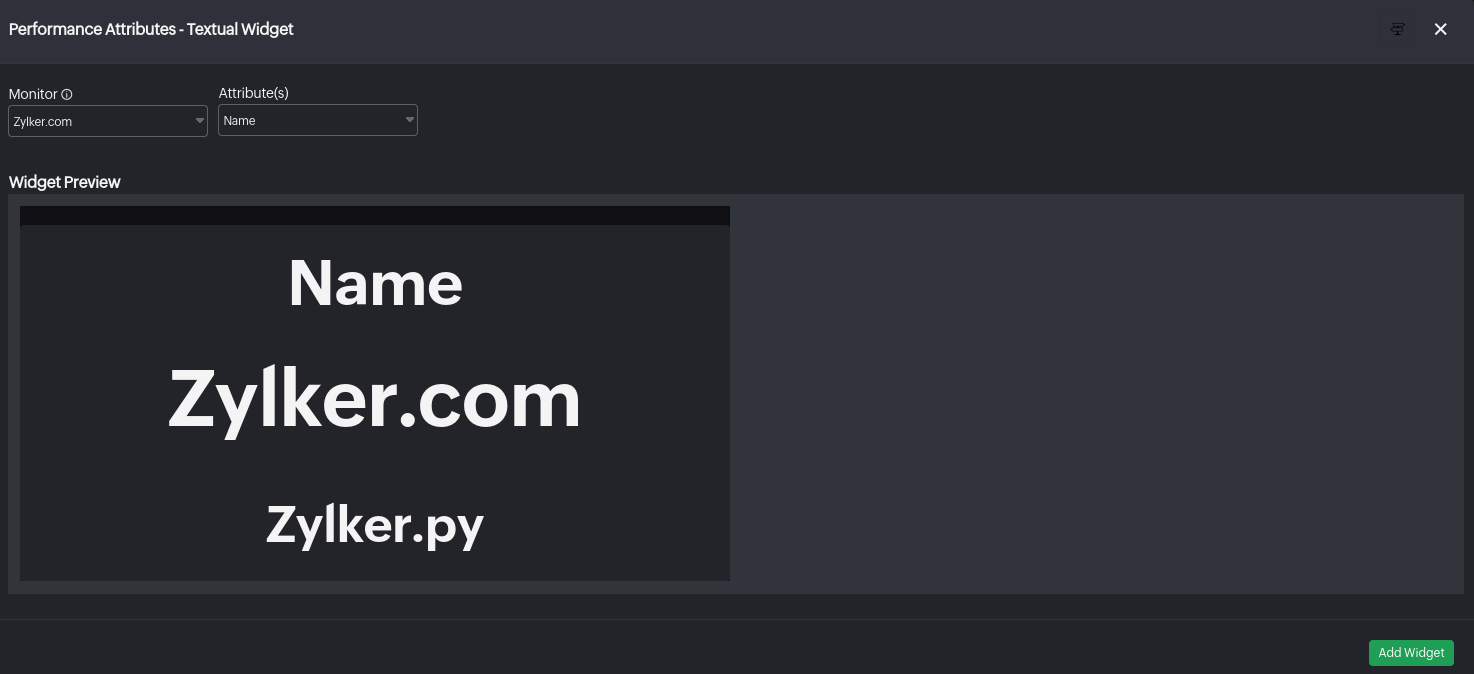
Textual Widget
The Textual Widget is a graphical user interface element that displays textual information related to monitored performance metrics, which can be useful for displaying specific metrics or status updates in a concise manner.
- Monitor(s): Choose the desired monitor.
Note
This feature is currently supported only for Network devices, Agentless Server Monitors, and Plugin monitors.
- Attributes: Choose the attributes for which you want to see a text widget.
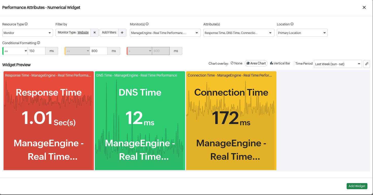
Numeric Widget
The Numeric Widget offers a straightforward way to view performance data in numeric format. It provides the flexibility to define conditional formatting for color-coded labels based on specified criteria. Additionally, you can select the preferred layout from Tabular, Honeycomb, or Grid views.
- Resource Type: Choose Monitor or Monitor Group.
- Monitor(s): Choose the desired monitor.
- Attribute(s): Choose the desired attributes.
- Child Entities: Choose specific child entities for which you want to view data. (Applicable for monitors with associated child entities.)
- Location: Select location filter (if applicable for the selected monitor).
- Conditional Formatting: Define conditions and specify custom metric values to render the widget data in green, orange, or red to denote severity. Once the actual data breaches any of the conditions, the corresponding color is applied to the data.
- Time Period: Select desired time period.
- Filter by: Filter the resources based on the Monitor Type, Monitor Groups, and Tags.
- Chart Overlay: You can select either an Area Chart or Vertical Bar to display the performance metrics trend behind your numerical widget.
Note: The performance metric displayed will correspond to the attribute selected.
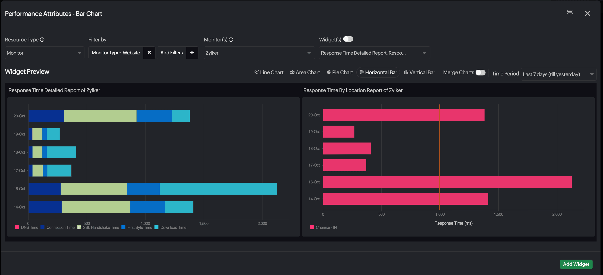
Performance Attributes - Bar Chart
Bar charts offer a straightforward way to visualize performance data along with color-coded bars based on specified criteria.
- Resource Type: Select Monitor, Monitor Group, Tags, or On-Premise Pollers.
NoteTo display the On-Premise Poller Health Dashboard in your widgets, select On-Premise Pollers in the Resource Type field.
- Monitor/Monitor Group: Select the desired monitor or monitor groups.
- Widget(s): Select pre-generated charts to add as a widget in your dashboard or you can enable the toggle button and choose your own attributes to create a chart. The toggle button will be enabled for Monitor Group automatically.
- Location: Select location filter. (If applicable for the selected monitor.)
- Merge Charts: Merge the charts of different resources or attributes you have selected for data comparison.
- Time Period: Select desired time period.
- Filter by: Filter the resources based on the Monitor Type, Monitor Groups, and Tags.
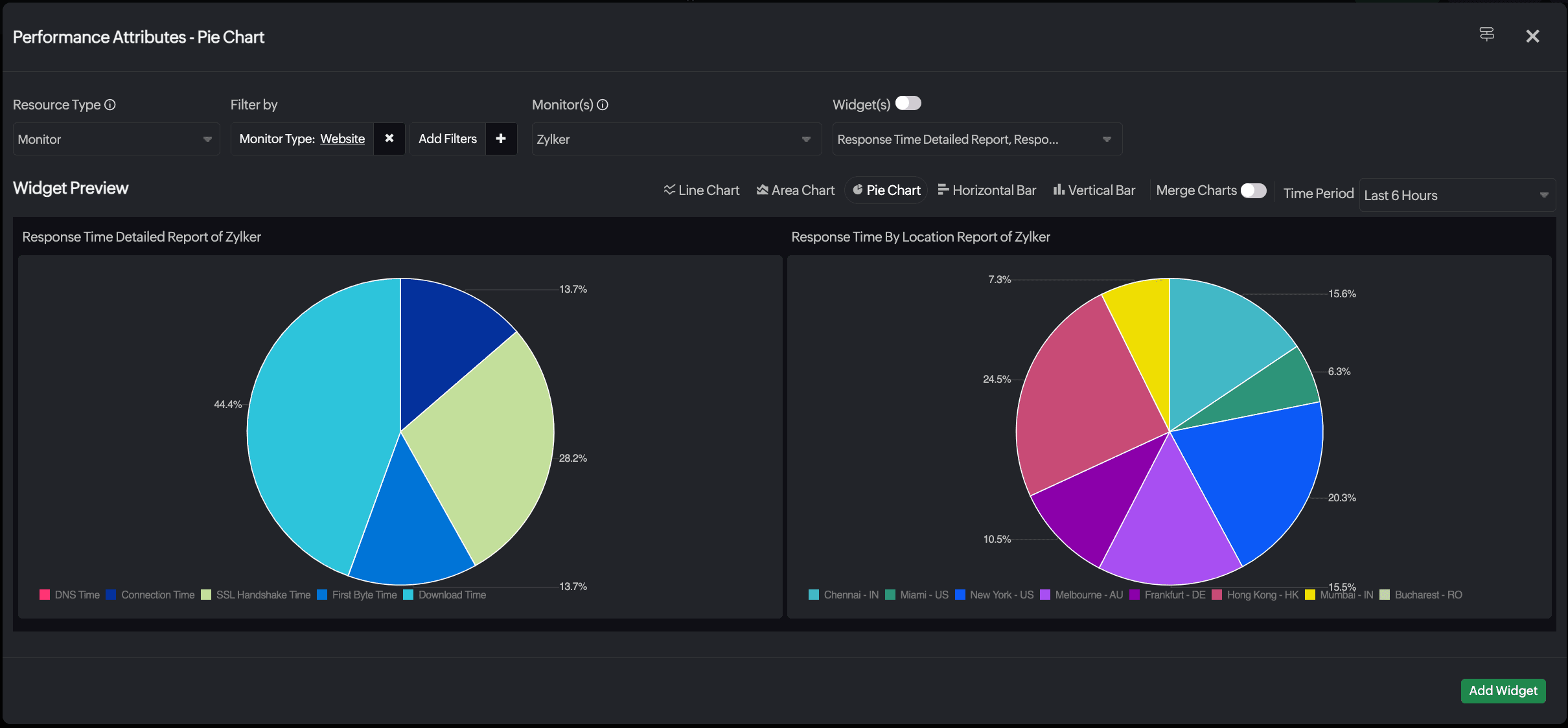
Performance Attributes - Pie Chart
Pie charts help visualize performance data with color-coded segments based on specified criteria.
- Resource Type: Select Monitor, Monitor Group, Tags, or On-Premise Pollers.
NoteTo display the On-Premise Poller Health Dashboard in your widgets, select On-Premise Pollers in the Resource Type field.
- Monitor/Monitor Group: Select the desired monitor or monitor groups.
- Widget(s): Select pre-generated charts to add as a widget in your dashboard or you can enable the toggle button and choose your own attributes to create a chart. The toggle button will be enabled for Monitor Group automatically.
- Choose Location: Select location filter (if applicable for the selected monitor).
- Merge Charts: Merge the charts of different resources or attributes you have selected for comparison of data.
- Time Period: Select desired time period.
- Filter by: Filter the resources based on the Monitor Type, Monitor Groups, and Tags.
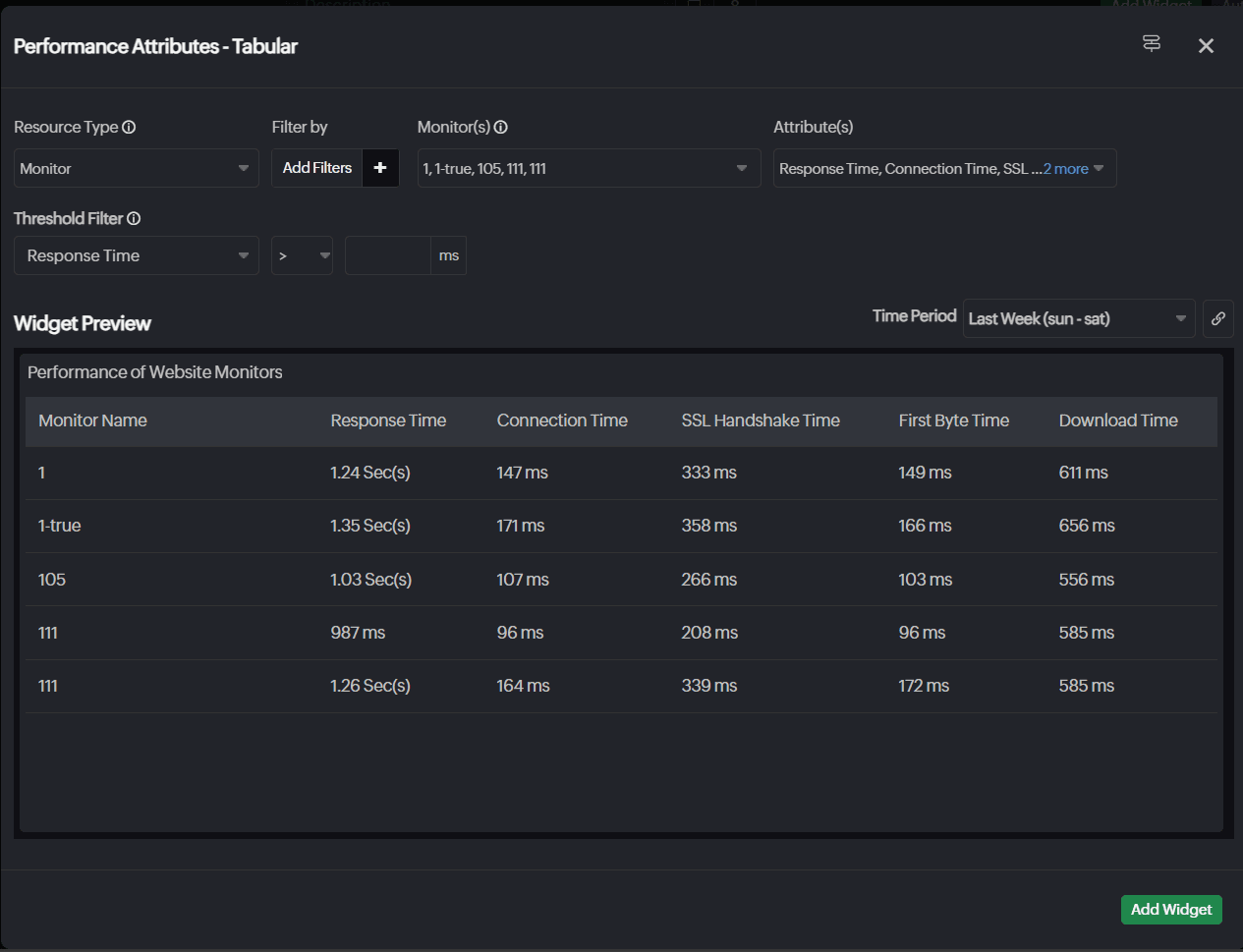
Performance Attribute - Table
Gain a comprehensive tabular view of the performance of various attributes across monitors to accelerate bulk data organization, data analysis, and trend and anomaly identification.
- Resource Type: Select Monitor, Child Entity, or On-Premise Pollers..
NoteTo display the On-Premise Poller Health Dashboard in your widgets, select On-Premise Pollers in the Resource Type field.
- Monitor Type: Choose the desired monitor type.
- Monitor(s): Choose the desired monitors.
- Attributes: Choose the desired attributes.
- Child Type: Choose the desired Child Type.
- Child Entities: Choose the desired Child Entities associated with the Child Type.
- Child Tag: Choose the desired Child Tag.
- Filter By: Filter the resources based on the Monitor Type, Monitor Groups, and Tags.
- Filter: Filter child entities by tag or monitor group. For network devices, you can also filter by category.
- Filter by Threshold: Configure threshold conditions for attributes and filter resources based on them.
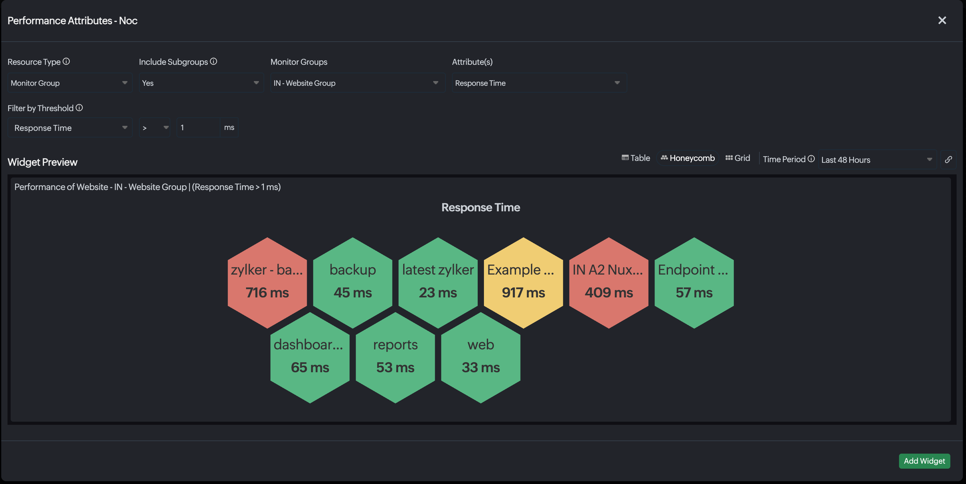
NOC View
Get a unified, real-time view of performance insights across all your monitored resources with the NOC View widget. Easily track critical performance attributes through intuitive, color-coded tiles based on monitor status that help you quickly spot and address issues. Click on any tile to drill-down into detailed metric insights for deeper analysis and faster troubleshooting. Customize the experience with a dark theme and switch effortlessly between Grid and Honeycomb layouts based on your preferred viewing style, with Honeycomb selected by default.
- Resource Type: Select Monitor, Monitor Group, or Child Entity.
- Include Subgroups: Select Yes or No to include the subgroups.
- Monitor Groups: Select the desired monitor group.
- Attributes: Select your desired attributes.
- Filter by Threshold: Configure threshold conditions for attributes and filter resources based on them.
- Time period: Select the desired time period.
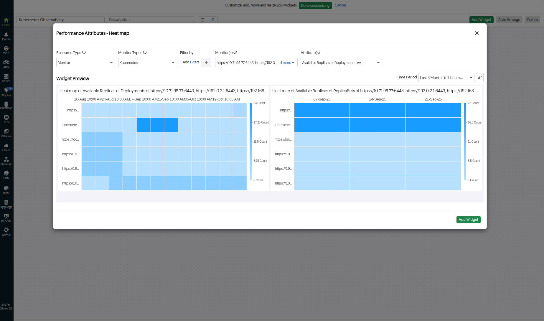
Performance Attribute - Heatmap
Analyze the performance of the top and bottom 50 monitors with the color-coded grid format Heatmap widget. It helps you quickly spot high-performing and underperforming resources that need attention. This makes it easier to prioritize troubleshooting, track performance trends, and manage resources effectively.
- Resource Type: Select All Monitors, Monitor, or Monitor Group.
- Monitor Type: Select your desired monitor type.
- Child Entities: Choose specific child entities for which you want to view data. (Applicable for monitors with associated child entities.)
- Attributes: Select your desired attributes.
- Show: Select Top 50 or Bottom 50 from the drop-down option.
- Time Period: Select the desired time period.
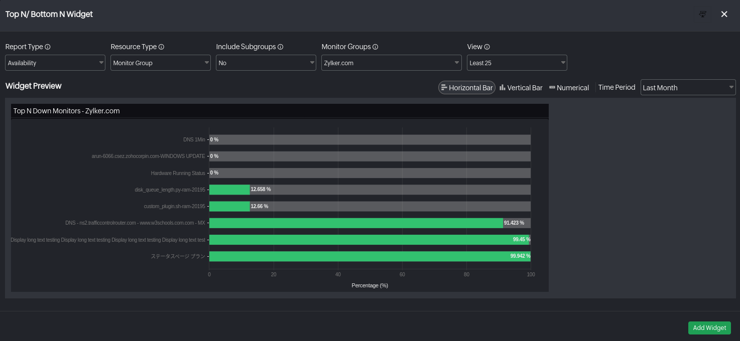
Top N/Bottom N Widget
The Top N Widget displays the best performing monitors of a similar type, while the Bottom N Widget showcases the least performing ones. Both widgets allow quick identification of areas requiring attention, offering various time periods for analysis and auto-refreshing every 10 minutes. They provide insight into metric values with hover-over details. These widgets are available for monitor types with preconfigured Top N and Bottom N reports.
- Available views: Visualize Top N/Bottom N data using multiple formats, including horizontal and vertical bar charts for quick comparisons, a treemap chart for proportional insights, and a tabular view for detailed analyses.
- Report Type: You can choose to see the Performance or Availability data of resources.
Performance
- Resource Type: Select All Monitors, Monitor, Monitor Group, or On-Premise Pollers.
- Monitor Type: Select your desired monitor type.
- Monitor Groups: Select your desired monitor group.
- Attributes: Select your desired attributes.
NoteIf the Monitor Type is set to APM Insight Application, the following attributes will be available
APM Insight Application attributes
- Average Web Transactions by Response time
- Background Transactions by Error Percentage
- Key Transactions by Errors
- Average Background Transactions by Response time
- Background Transactions by CPU Time
- Errors by Count
- 4XX Error Count
- Key Transactions by Count
- Web Transactions by Errors
- Exceptions by Count
- Web Transactions by Fatal Count
- Key Transactions by Fatal Count
- Web Transactions by Apdex
- Web Transactions by Response Time
- Background Transactions by Response Time
- Key Transactions by CPU Time
- Key Transactions by Error Percentage
- Web Transactions by Count
- Web Transactions by CPU Time
- Background Transactions by Errors
- Web Transactions by Error Percentage
- Key Transactions by Apdex
- 5XX Error Count
- Background Transactions by Count
- Average Key Transactions by Response time
- Database Queries by Count
- Database Queries by Average Response Time
- Slow Database Queries
- HTTP Transaction Groups by Count
- HTTP Transaction Groups by Apdex
- HTTP Transaction Groups by CPU Time
- HTTP Transaction Groups by Average Response Time
- HTTP Transaction Groups by Error Count
- HTTP Transaction Groups by Error Percentage
- HTTP Transaction Groups by Fatal Exception Count
- Background Transaction Groups by Count
- Background Transaction Groups by Average Response Time
- Background Transaction Groups by CPU Time
- Background Transaction Groups by Error Count
- View: Choose to see the Top N or Bottom N of the selected resource.
- Time Period: Select desired time period.

Availability
Monitor the availability of your resources effortlessly by using Availability widgets on your dashboard for convenient tracking.
- Resource Type: Select All Monitors, Monitor, or Monitor Group.
- Monitor Type: Select your desired monitor type.
- Include Subgroups: If you select Monitor Group, choose whether you want the data of the subgroups to be included as well.
- Monitor Group: Select your desired monitor group.
- View: Choose to see the Top N or Bottom N of the selected resource.
- Time Period: Select desired time period.
NoteThe Numeric widget preview includes the Monitor Name, Availability %, and Down Duration columns.

Availability Trend
Availability Trend - Graphical Widget
The Availability Trend Widget showcases the availability data of your monitors for a predefined time period in a graphical chart view. You can view the available, unavailable and maintenance percentage split for a specific time stamp.
- Resource Type: Select All Monitors, Monitor, Monitor Group, or Monitor Type.
- Choose Monitor(s): Select your desired monitor(s).
- Include Subgroups: If you select Monitor Group, select if you want the data of the subgroups to be included as well.
- Monitor Group: Select your desired monitor group.
- Choose Monitor Type: Select your desired monitor type.
- Time Period: Select desired time period.
- Filter by: Filter the resources based on the Monitor Type, Monitor Groups, and Tags.

Availability Trend - Numeric Widget
You can view the availability data of your monitors and monitor groups for a predefined time period in the Numeric Widget. The data is presented in numerical digits. You can also define the criteria for Conditional Formatting, which lets you set custom metric values to display widget data in green, orange, or red based on predefined conditions. When data breaches these conditions, the corresponding color is applied, making it easy to identify severity levels at a glance.
- Resource Type: Select All Monitors, Monitor, Monitor Group, Monitor Type or Child Entity.
- Choose Monitor(s): Select your desired monitor(s).
- Filter by: Filter the resources based on the Monitor Type, Monitor Groups, and Tags.
- Include Subgroups: Select if you want the data of the subgroups to be included as well. (applicable if you select monitor groups)
- Child Entity Type: Select the desired Child Entity Type from the drop-down menu to view the associated Child Entities. This field is displayed only for selected monitor type and lists the Child Entity Type available.
- Filter by: The Filter by drop-down menu adjacent to the Child Entities allows you to filter the child entities based on the Child Tag(s).
- Child Entities: Select the Child Entities associated with the chosen Child Entity Type from the drop-down menu.
- Monitor Group: Select your desired monitor group.
- Conditional Formatting: Define conditions and specify custom metric values to render the widget data in green, orange, or red. Once the actual data breaches any of the conditions, the corresponding color is applied to the data.
- Time Period: Select desired time period.
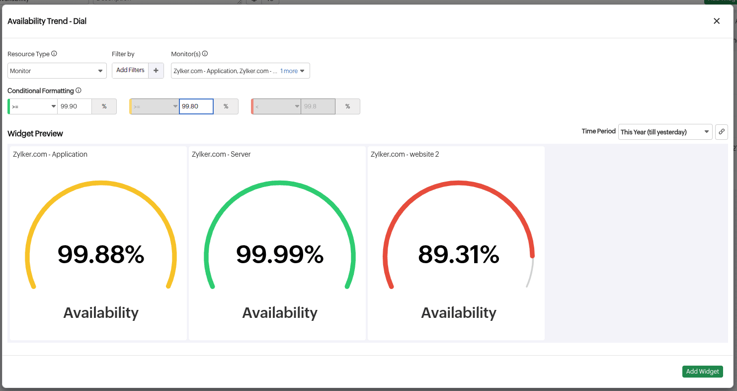
Availability Trend - Dial Widget
The Dial widget visually represents the availability of your monitoring resources over a predefined period using color-coded segments. Based on custom thresholds, the dial displays green, orange, or red segments, helping you quickly identify performance deviations at a glance.
- Resource Type: Select All Monitors, Monitor, Monitor Group, or Monitor Type.
- Monitor(s): Select your desired monitor(s).
- Include Subgroups: Select if you want the data of the subgroups to be included as well. (Applicable if you select Monitor Group.)
- Monitor Group: Select your desired Monitor Group.
- Conditional Formatting: Define conditions and specify custom metric values to render the widget data in green, orange, or red. Once the actual data breaches any of the conditions, the corresponding color will be applied to the data.
For example, you can configure the dial gauge to show green if availability is 99.99% or higher; yellow if availability is between 99.88% and 99.99%; and red if availability drops to 89.31% or below. - Time Period: Select the desired time period.
- Filter by: Filter the monitors based on the Monitor Type, Tag, or Monitor Group.
Events
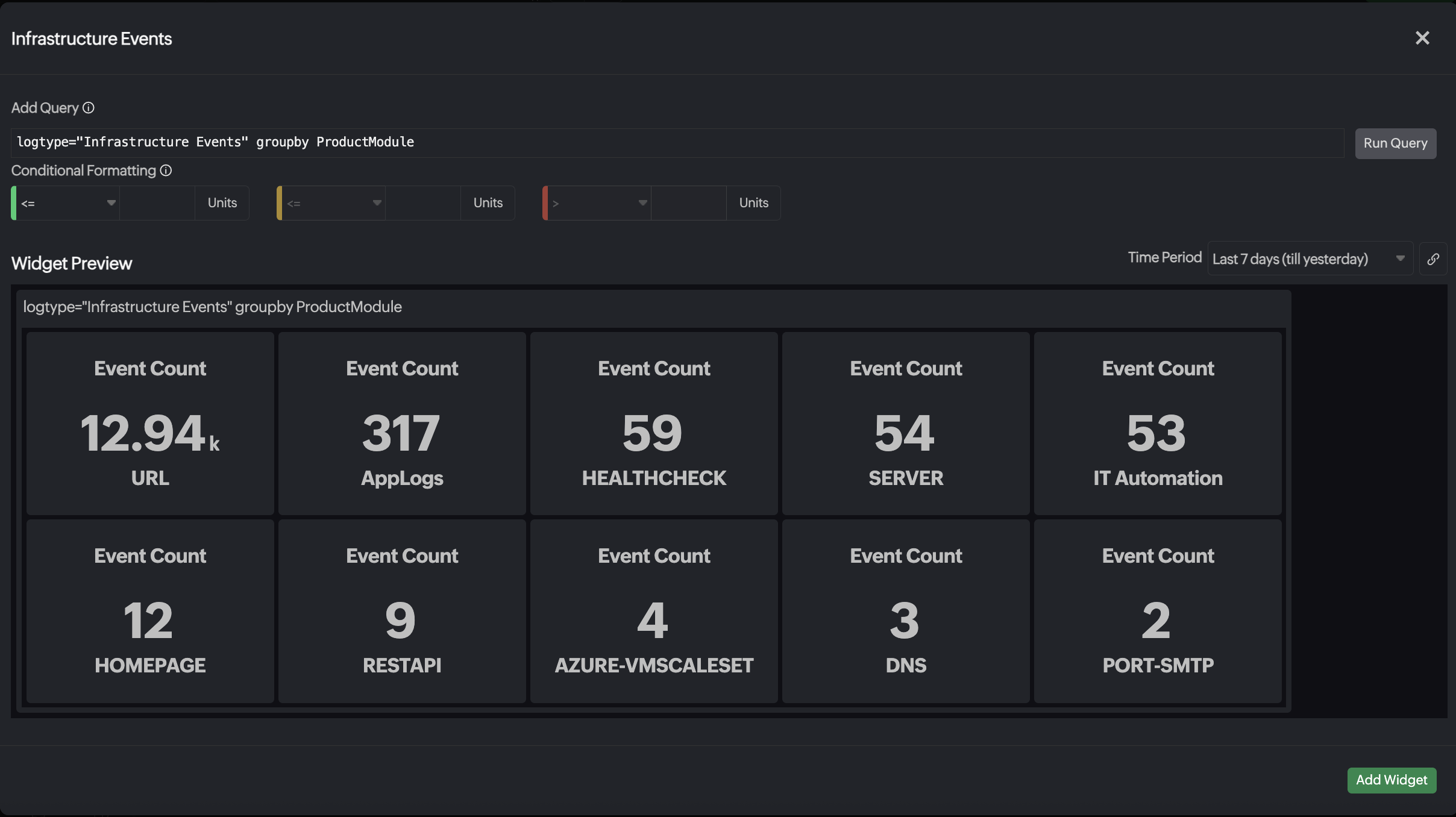
Infrastructure Event widget
View the total number of all Infrastructure Events based on the given query, providing a centralized view for tracking events using the Events widget.
Note
When using the GROUP BY feature to group results, apply a LIMIT clause to restrict the display to a maximum of 50 events.
- Add Query: Enter a query to narrow down the events to be displayed in the dashboard.
- Conditional Formatting: Define conditions and specify custom metric values to render the widget data in green, orange, or red to denote severity. Once the actual data breaches any of the conditions, the corresponding color is applied to the data.
- Time Period: Select the desired time period.
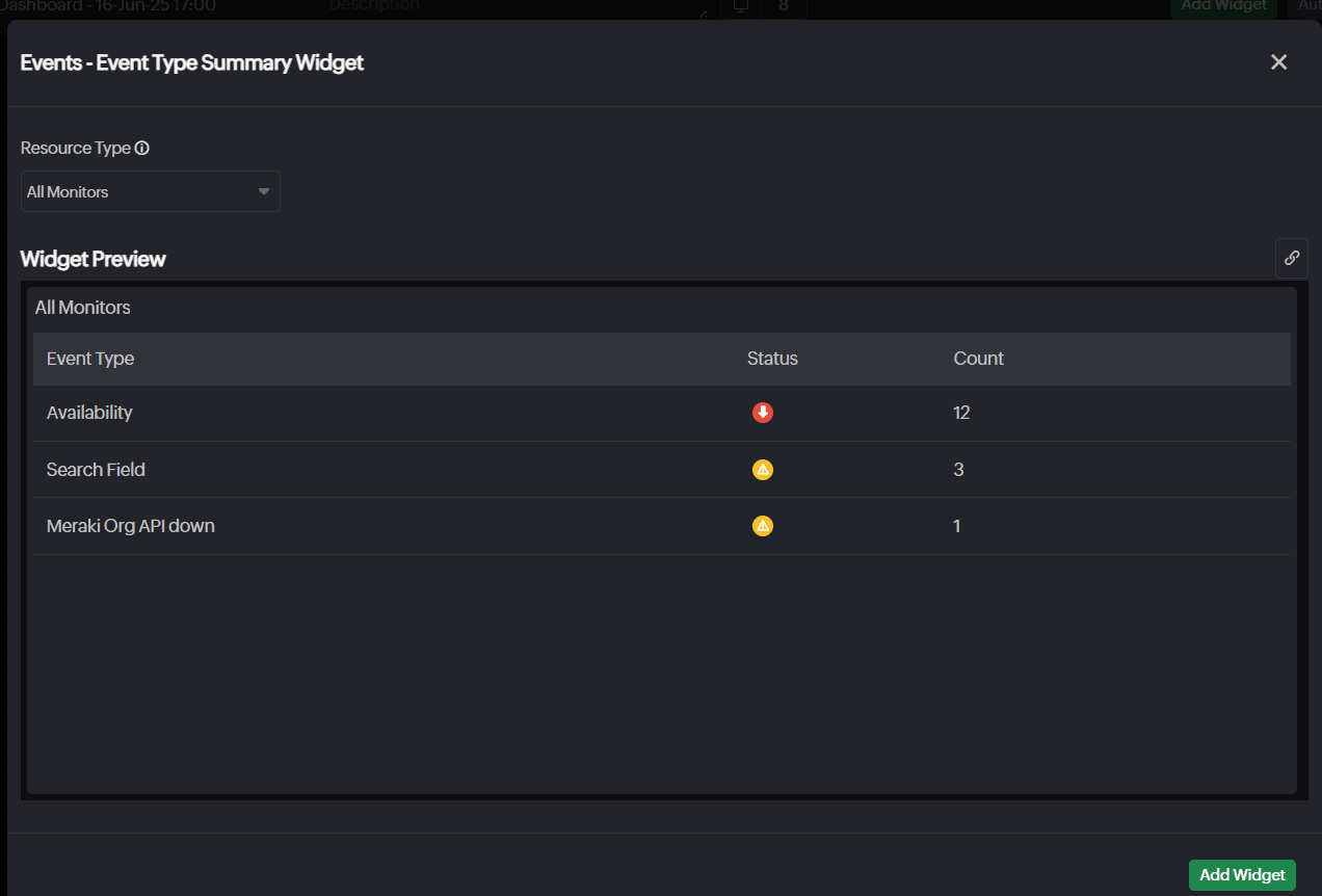
Events - Event Type Summary
Monitor your system's health and performance with the Event Type Summary widget. Prioritize critical events and troubleshoot recurring event types with insights on the status and count of the different types of events across resources.
Resource Type: Select the desired resource type.
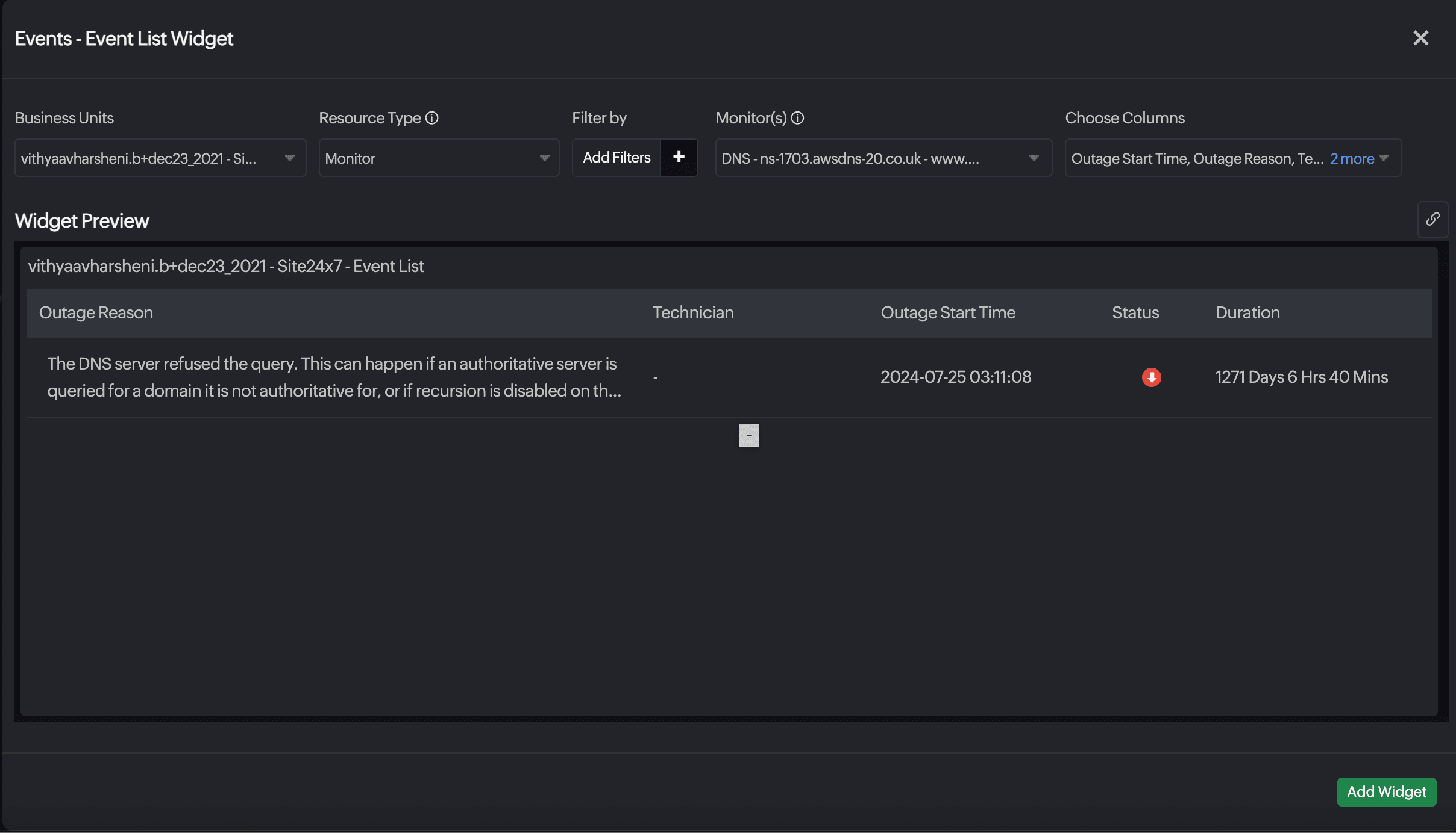
Event List
View a consolidated list of events that occurred in your resources over the past 24 hours to quickly assess performance and activity status.
- Resource Type: Select the desired resource type.
- Filter by: Filter the resources based on monitors.
- Monitor(s): Select the desired monitors.
- Choose Columns: Select the columns to display the Outage Start Time, Outage Reason, Technician, and Status.
Application
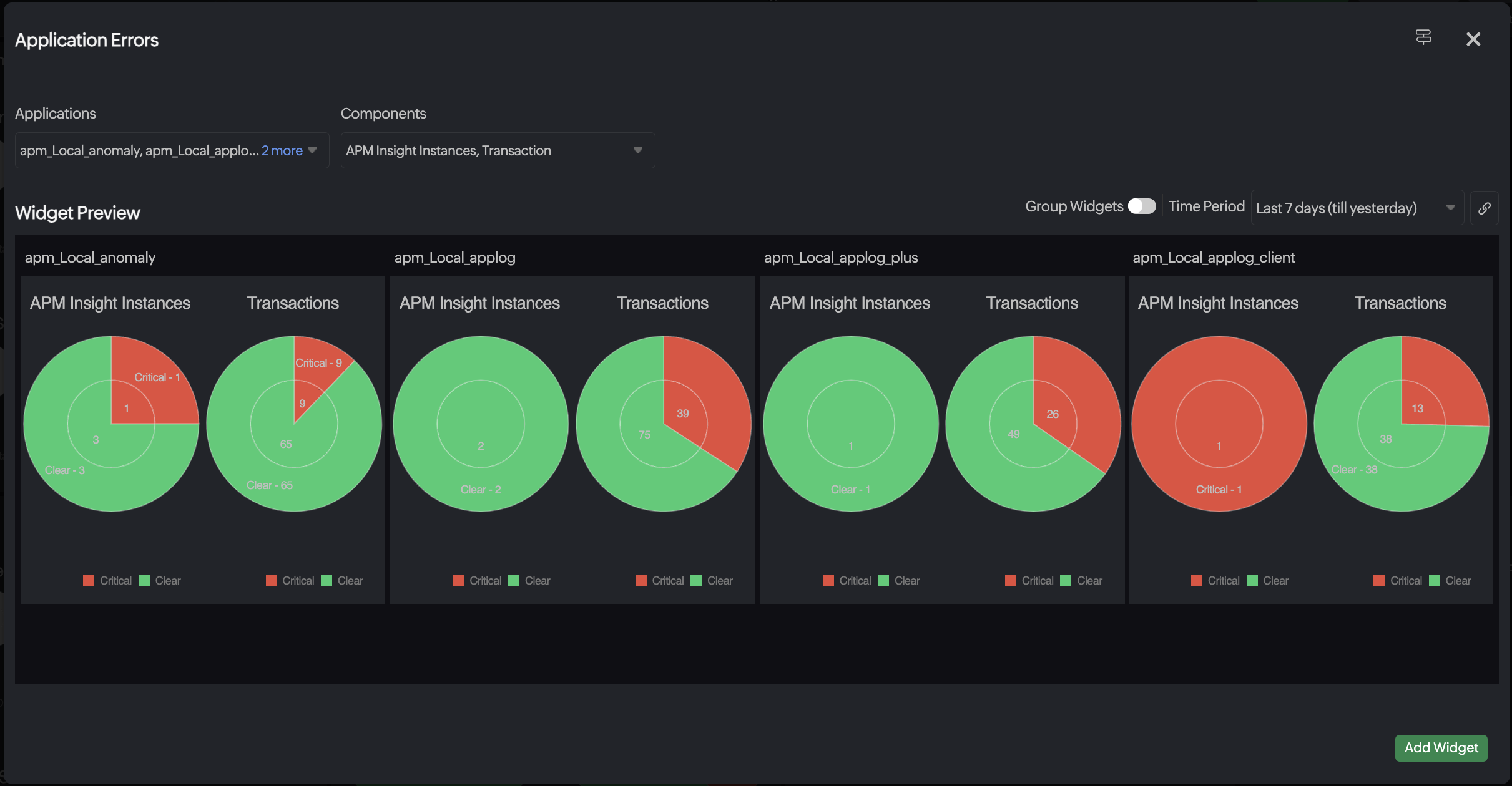
Application Errors Widget
Application Errors widget allows you to monitor and analyze events related to your applications within Site24x7, providing a comprehensive view of application health, performance issues, and critical alerts. It consolidates event data, offering a real-time event list for tracking the status and performance of your applications. With detailed insights into application errors, the widget facilitates prompt diagnosis and resolution. Users can specify a time frame to filter displayed events and view ongoing issues for deeper analysis, while also highlighting critical events to prioritize troubleshooting efforts effectively.
These are the following fields you will need to fill:
- Applications: Choose the desired application for which you want to monitor the events.
- Components: Select the associated components.
- Group Widgets: Organize widgets into a group for better visualization.
- Time period: Select the desired time period for which you want to view events.
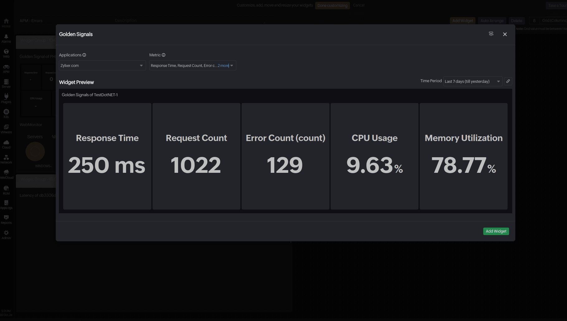
Golden Signals
Golden Signals are a set of metrics that help track the latency, traffic, errors, and saturation of various applications in APM Insight.
- Applications: Select the application to track its performance.
- Metric: Select the key metrics to display for the selected application, such as CPU Utilization, Memory Utilization, Error Count, Response Time, Request Count, Disk I/O, Error Rate, Network Bandwidth, or Throughput.
- Time Period: Select the desired time period.
Transactions
The Transactions widget enables monitoring and analyzing your application's transactions within Site24x7, offering a detailed view of performance, reliability, and user satisfaction. It consolidates transaction data, providing a real-time tabular view for tracking the performance of your applications. With insights into each transaction, the widget facilitates prompt identification and optimization of critical processes and pinpoints performance bottlenecks. Users can select attributes to track, sort them for clarity, and include additional attributes via the ![]() icon in the web client for customized analysis.
icon in the web client for customized analysis.
These are the following fields you will need to fill in:
- Resource Type: Select Monitor, Monitor Group, or Tag.
- Monitor Groups: Select the desired monitor group.
- Monitor Types: Select the desired monitor type. The available options are:
- APM Insight Application: Displays transactions of the selected type across all applications within the chosen monitor group. You can gain a consolidated view of specific transaction types and analyze performance more effectively.
- APM Key Transaction: Displays the key transactions of chosen monitor group or tags.
- Application: Select your desired application.
- Transaction type: Select your desired transaction type from Key, Web, Background, Groups, Background Groups, and Error.
- Attributes: Select the attributes for which you need to see the values in the transaction table. The set of attributes differs based on the type of application and transaction type.
- Time Period: Select the desired time period for which you want to view the transactions.
Alarms/Current Status
The Alarms Widget helps to view the Down, Critical, Trouble, and Maintenance alarms count for your selected resources in a single widget view. It will display the number of monitors with error along with the total number of monitors. The color of the number of monitors with error will be based on the status with the highest count. If the statuses have the same count, the order of priority for the color would be Down, Critical, Trouble, and Maintenance.
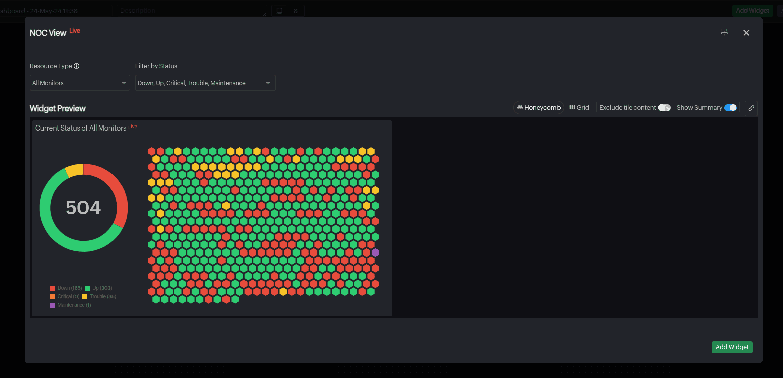
NOC View
Monitor your entire account's status in real-time on a single, scroll-free dashboard with the NOC View. Each monitor is displayed as a tile with unique color codes indicating its real-time status. You can fit up to 10K monitors in one screen. The reasons for critical statuses such as Down, Critical, Trouble, or Configuration Error will be displayed for ease of immediate remediation. Clicking a tile reveals monitor details. Customize the NOC View with a darker theme. While all allowed monitors are visible, real-time status updates are only shown for users designated as alert contacts. Your recent NOC screen with active filters is always accessible via cookies. The NOC View allows you to switch between the Grid and Honeycomb layouts for your preferred visualization option. Honeycomb layout is selected by default.
- Resource Type: Select All Monitors, Monitor, Monitor Group, Monitor Type, Tags or Child Entity.
- Monitor(s): Select your desired monitor(s).
- Subgroups/Monitors: Select if you want the data of the subgroups or monitor groups to be included as well. (Applicable if you select Monitor Group.)
- Monitor Group: Select your desired monitor group.
- Monitor Type: Select your desired monitor type.
- Filter by Status: Filter the resources based on the status of the monitors.
-
Child Entity: Select a specific Child Entity to see the related Child Entity Type and Child Entities.
-
Child Entity Type: Select a Child Entity Type to view the associated Child Entities in the NOC View. This field is displayed only for certain monitor types, like server, network, metrics, Cisco ACI, and NetFlow device monitors.
-
Child Entities: Select the Child Entities associated with the chosen Child Entity Type. If no selection is made in this field, the NOC View will present the status of all the Child Entities related to the selected Child Entity Type. If multiple Child Entity Types are chosen, you cannot see the Child Entities.
- Child Tag: Choose the desired Child Tag.
-
-
Filter by: Filter the monitors based on Tags and Monitor Groups when Child Entity is selected as the Resource Type.
Additionally, you can select the preferred layout from Honeycomb, Grid, or List views. You can also use the Exclude data toggle to exclude the data from the tiles.
Show Summary: Toggle to view the number of monitors based on status along with their details in a doughnut chart. The doughnut chart displays the total number of resources.
Use the legend to toggle monitors in the NOC view and doughnut chart. For instance, clicking Down in the legend hides Down monitors, showing only the remaining monitors.
The List view is available only for resource type categorized as Child Entity.
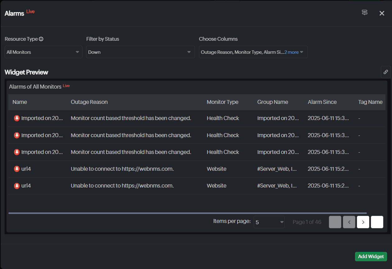
Alarms
Gain real-time visibility of live alarms across all resources to diagnose and resolve issues and ensure continuous system availability.
- Resource Type: Select the desired resource type.
- Filter by Status: Filter the alarms based on Down, Critical, or Trouble status.
- Choose Column: Select the columns to display the Outage Reason, Monitor Type, Alarm Since, Last Polled, Monitor Groups, Tags, and Technician.
- Child Tag: Choose the desired Child Tag.
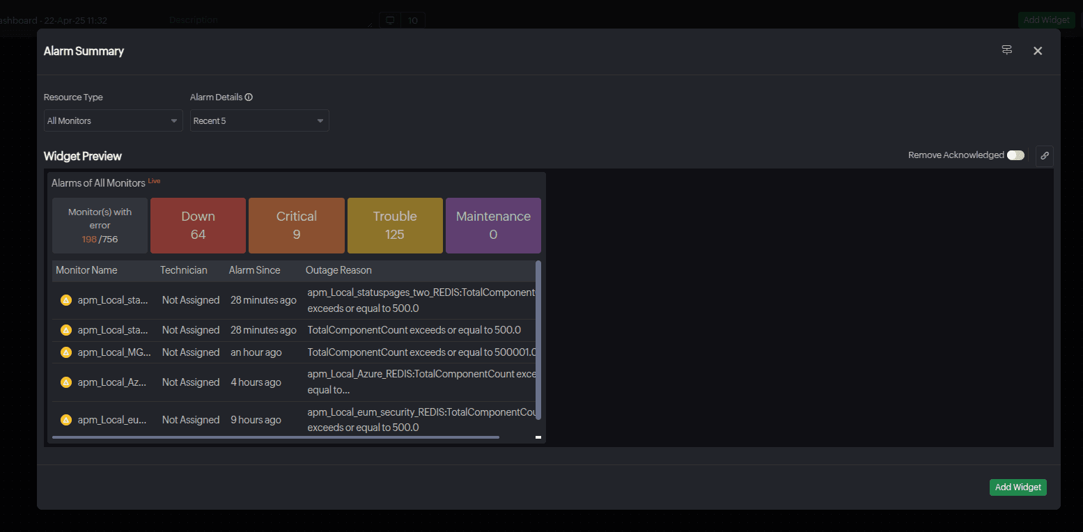
Alarm Summary
Get a quick overview of your monitor's alarm details, including reports and tag associations.
- Resource Type: Select All Monitors, Monitor Group, Monitor Type, or Tags.
- Include Subgroups: Select if you want the data of the subgroups to be included as well (if you select Monitor Group).
- Choose Monitor Type: Select your desired monitor type.
- Monitor Group: Select your desired monitor group.
- Alarm Details: Filter recent alarms based on count—5, 10, 20, 25, or None. When None is selected, only the summary count is displayed. By default, None is selected.
- Remove Acknowledged: Toggle to show alarms that have not yet been assigned to technicians.
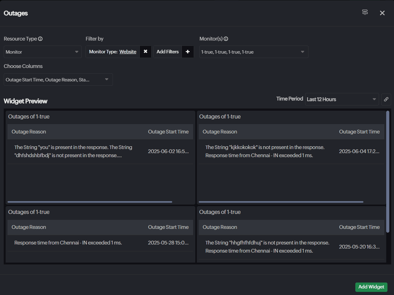
Outages
Mitigate downtime with an informed outage summary of the resources and troubleshoot quickly to manage system availability and performance.
- Resource Type: Select the desired monitor to know the outage summary.
- Filter By: Filter the resources based on Monitor Type, Monitor Groups, or Tags.
- Monitor(s): Select the desired monitors.
- Choose Columns: Select the columns to display the Outage Start Time, Outage Reason, Technician, and Status.
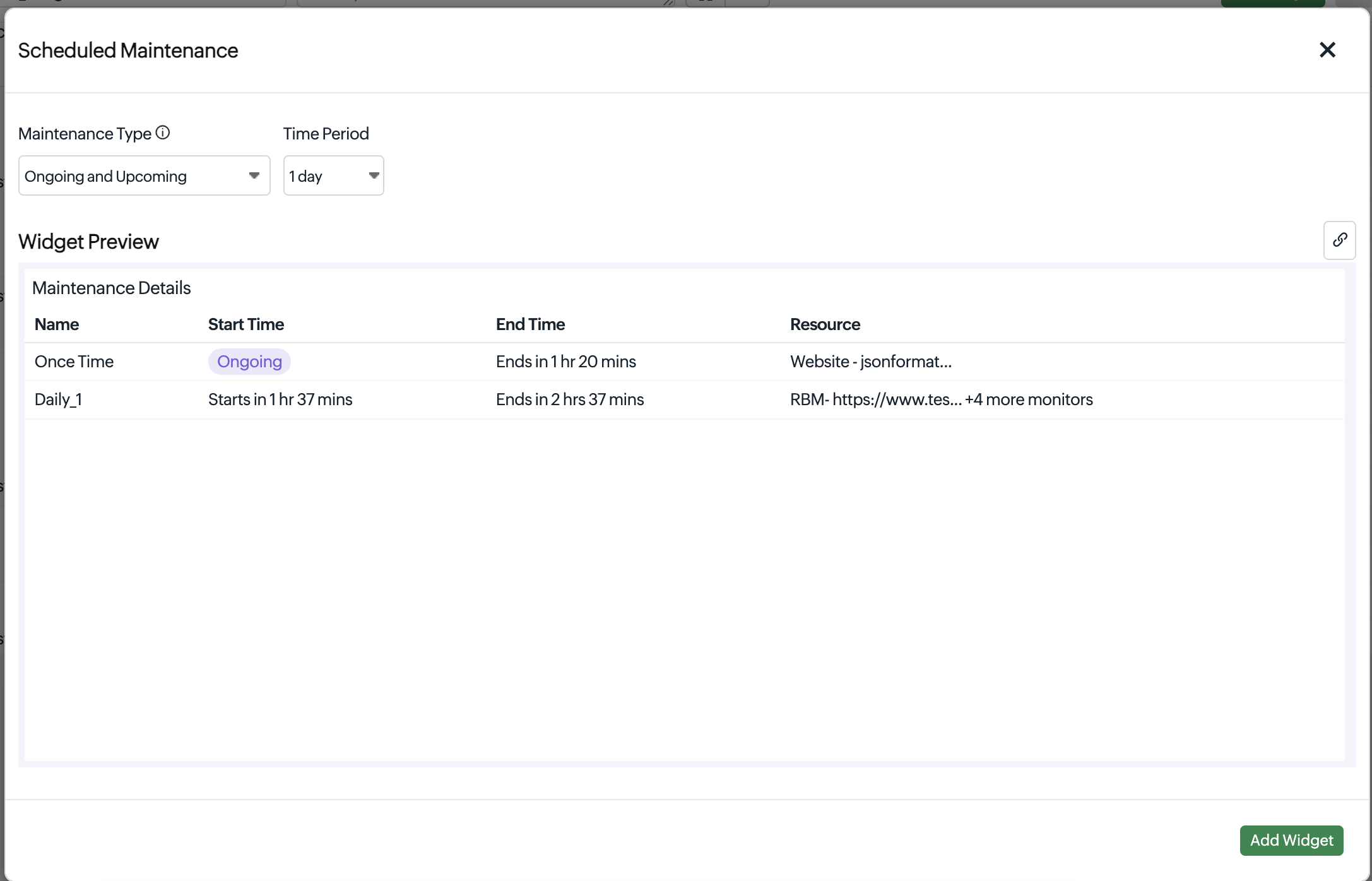
Scheduled Maintenance
The Scheduled Maintenance widget provides a consolidated view of ongoing and upcoming maintenance activities for your monitored resources. You can track the start time, end time, and duration of each maintenance window at a glance, so you always know which resources are unavailable and for how long. Additionally, the time period filter allows you to focus on maintenance scheduled within the next one to seven days, helping your team plan ahead and set the right expectations with your users.
- Maintenance Type: Choose whether to view only Upcoming maintenance or both Ongoing and Upcoming maintenance activities.
- Time Period: Select the desired time period from one to seven days.
Ongoing maintenance activities are always displayed regardless of the selected time period. The Time Period filter applies only to upcoming maintenance.
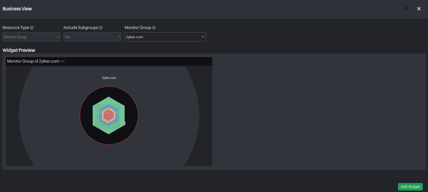
Business View
The Business View Widget shows the business view of your selected monitor group in the widget view. You'll be able to identify the current status of every monitor in each groups using their status color codes. The status and color code of each subgroup will be decided based on the preset threshold value configured by the user during the monitor group and subgroup set up.
- Resource Type: It will be set to Monitor Group by default.
- Include Subgroups: Subgroups will be included by default.
- Monitor Group: Choose the desired monitor group for which you want to see the Business View.
Alarm Snapshot
Get a quick overview of the total count of your monitors with alarms categorized by Up, Down, Trouble, and Critical statuses. This summary can be based on all monitors or a specific monitor type. It displays the monitor name, Alarms count, Total Monitors, and Problematic Monitors count.
The icon displayed in the result indicates the highest severity level of the alarms. For instance, if Ping monitors report the highest severity as Down, then the down icon ![]() will be shown. The severity levels follow this hierarchy:
will be shown. The severity levels follow this hierarchy:
- Critical: High
- Down: Medium
- Trouble: Low
Problematic monitors are those in Trouble, Critical, or Down statuses. If events are enabled for a monitor, the count reflects event occurrences; otherwise, it is based solely on alarm counts.
- Resource Type: Select All Monitors, or Monitor Type.
- Monitor Type: Select your desired monitor type.

Currently, Site24x7 supports only Network Device as the monitor type.

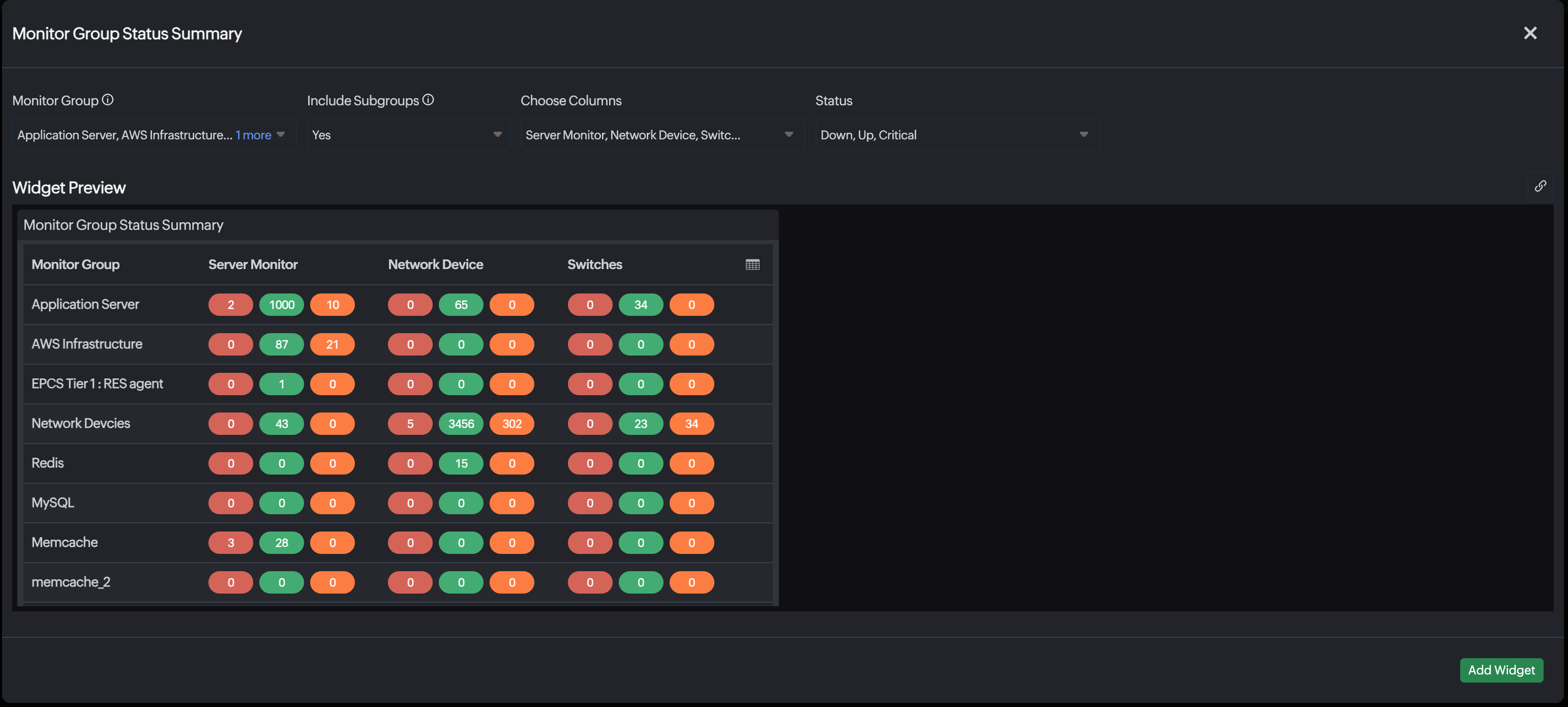
Monitor Group Status Summary
Gather a centralized, real-time overview of the health and status summary of multiple monitor groups and their subgroups with the Monitor Group Status Summary widget. It allows users to filter by monitor group, include subgroups, customize visible monitor categories, and view status counts such as Up, Down, Critical, and Trouble across different monitoring types like Websites, REST APIs, Storage, and UPS devices. You can quickly identify issues, monitor infrastructure health at scale, and improve the overall response time.
- Monitor Group: Select the desired monitor group.
- Include Subgroups: Select Yes or No from the drop-down menu to include or exclude the subgroups.
- Choose Columns: Select the desired columns to be displayed.
- Status: Select the desired status.
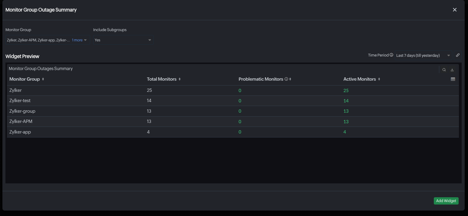
Monitor Group Outage Summary
Obtain a consolidated view of outage-related statistics across selected monitor groups with the Monitor Group Outage Summary widget. It displays key metrics such as the total number of monitors, monitors in Down, Critical, and Trouble status, and active monitors within a chosen time period, helping teams quickly assess the operational status of their infrastructure. Additionally, you can include subgroups for selected time range to accelerate outage tracking and issue identification.
- Monitor Group: Select the desired monitor group.
- Include Subgroups: Select Yes or No to include the subgroups.
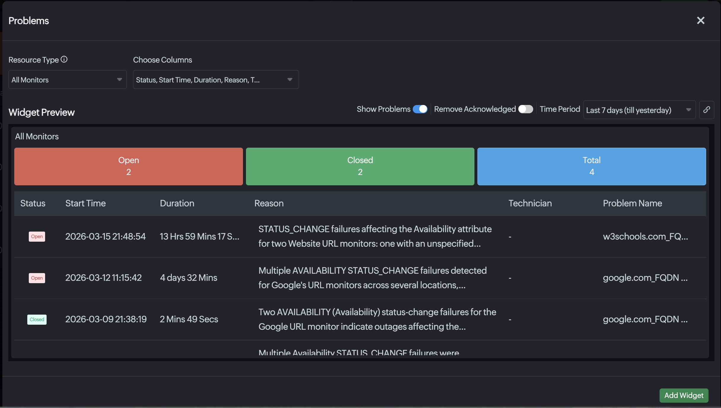
Problems
Gather a quick overview of the event-correlated issues using the Problems widget. You can instantly see the status, reason, and duration of each problem. With just a click, navigate directly to the detailed event analysis page for faster troubleshooting and resolution.
- Resource Type: Select All Monitors or Monitor Group.
- Choose Columns: Select the columns to display from Reason, Start Time, End Time, Group Name, and Status.
- Show Problems: Enable this option to display the details of all problems.
- Time Period: Select the desired time period.
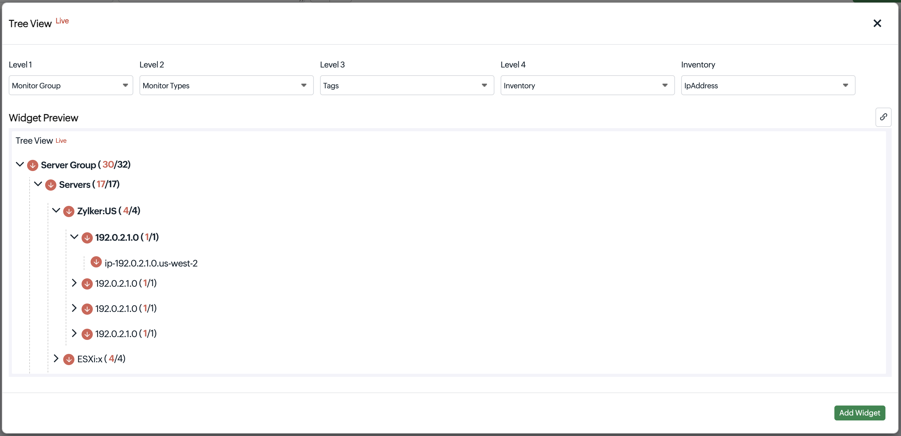
Tree View
Gain a hierarchical view of monitors with their current statuses in custom dashboards using the Tree View widget. You can organize resources across multiple levels to quickly identify related monitors and their operational status. Select the layers of hierarchy by choosing the resource type.
Inventory attributes include resource details such as hardware specifications, system configurations, and device information.
Level: Select a resource category such as Monitor Type, Monitor Group, Tag, or Inventory to define the hierarchy level in the tree view.
Geo Locations
The Geo Locations widget provides a visual representation of your monitored resources across the globe. It helps you quickly understand the geographical distribution and real-time status of your monitors, making it easier to identify regional outages, performance issues, or localized failures at a glance.
Using this widget, you can view the health of your websites or services from multiple monitoring locations worldwide, filtered by resource type, domain, and status.

The image above shows the Geo Locations widget.
- Resource Type: Select the resource type. The available options are All Monitors, Monitor Type, Monitor Group, and Tags.
- Domain: Choose the domain to filter monitors based on domains.
- Filter by Status: View resources by their current status—Up, Down, Critical, or Trouble.
For a selected resource type and domain, each resource on the map is assigned a status color based on the number of monitoring locations.
- Status colors used in the widget:
Status Color Status Green Indicates the resource is Up (operational) Yellow Trouble Orange Critical Red Down
The location map supports zooming in and out for a closer or wider view.
- When a resource has multiple active statuses, the map prioritizes and displays the status with the highest severity.
- This widget is specifically for Internet Service monitors.
Inventory
If you've an AWS Monitor in your account, the following inventory widgets can be added to your dashboard based on account and resources.
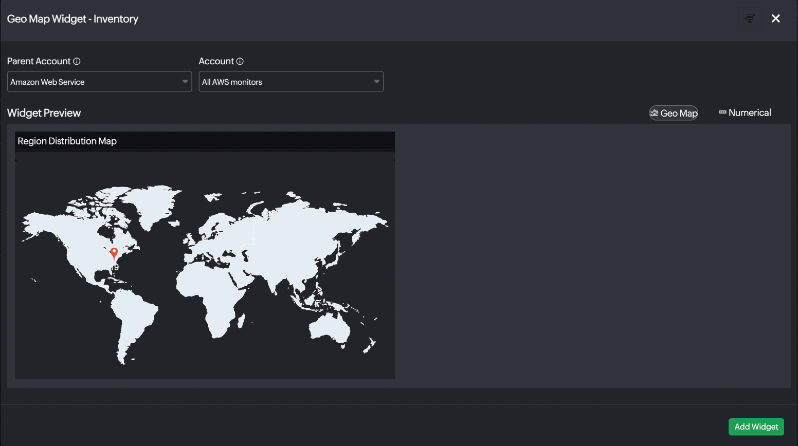
Geo Map
Geo Map will provide the resource breakdown by region. You can choose to view the region map or the numerical data of the resources from a region.
- Parent Account: Choose the parent account (monitor type).
- Account: Choose the desired monitor.
- Aggregation: Select Parent Account to view data for resources discovered in the parent account, and choose Linked Accounts to access combined data for all resources discovered through Control Tower integration. This field is applicable only for Control Tower accounts.
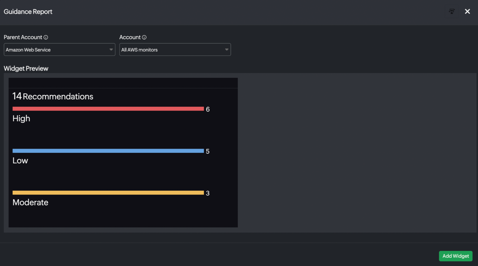
Guidance Report
You can view your monitor's guidance reports here.
- Parent Account: Choose the parent account (monitor type).
- Account: Choose the desired monitor.
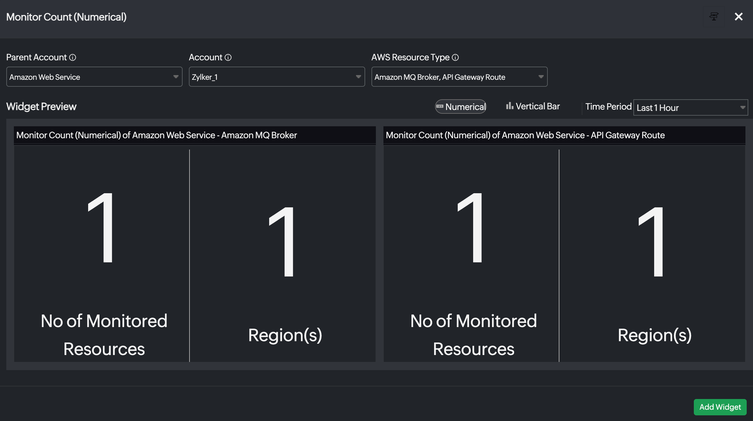
Monitor Count
You can view the total number of monitored AWS resources and the region-based service count split-up data as a numerical widget. You can visualize the region-based service distribution split-up data in a table with the numerical option and view how the different AWS services have been operating during a selected time range with the Vertical Bar chart option.
- Parent Account: Choose the parent account (monitor type).
- Account: Choose the desired monitor.
- AWS Resource Type: Choose the desired AWS resource type.
- Aggregation: Select Parent Account to view data for resources discovered in the parent account, and choose Linked Accounts to access combined data for all resources discovered through Control Tower integration. This field is applicable only to the Control Tower accounts.
Widget Grouping
Easily organize your widgets by grouping them together to consolidate relevant resources.
Widget groups can be arranged in the following three different formats:
- Fit: The boundary of the widget group is fixed, and all widgets added to it automatically resize to fit within it.
- Vertical Scroll: The widget group’s boundary can extend vertically based on the number of widgets added, and a vertical scroll bar will appear to navigate through all widgets within the boundary.
- Horizontal Scroll: The widget group’s boundary can extend horizontally based on the number of widgets added, and a horizontal scroll bar will appear to navigate through all widgets within the boundary.

General widgets
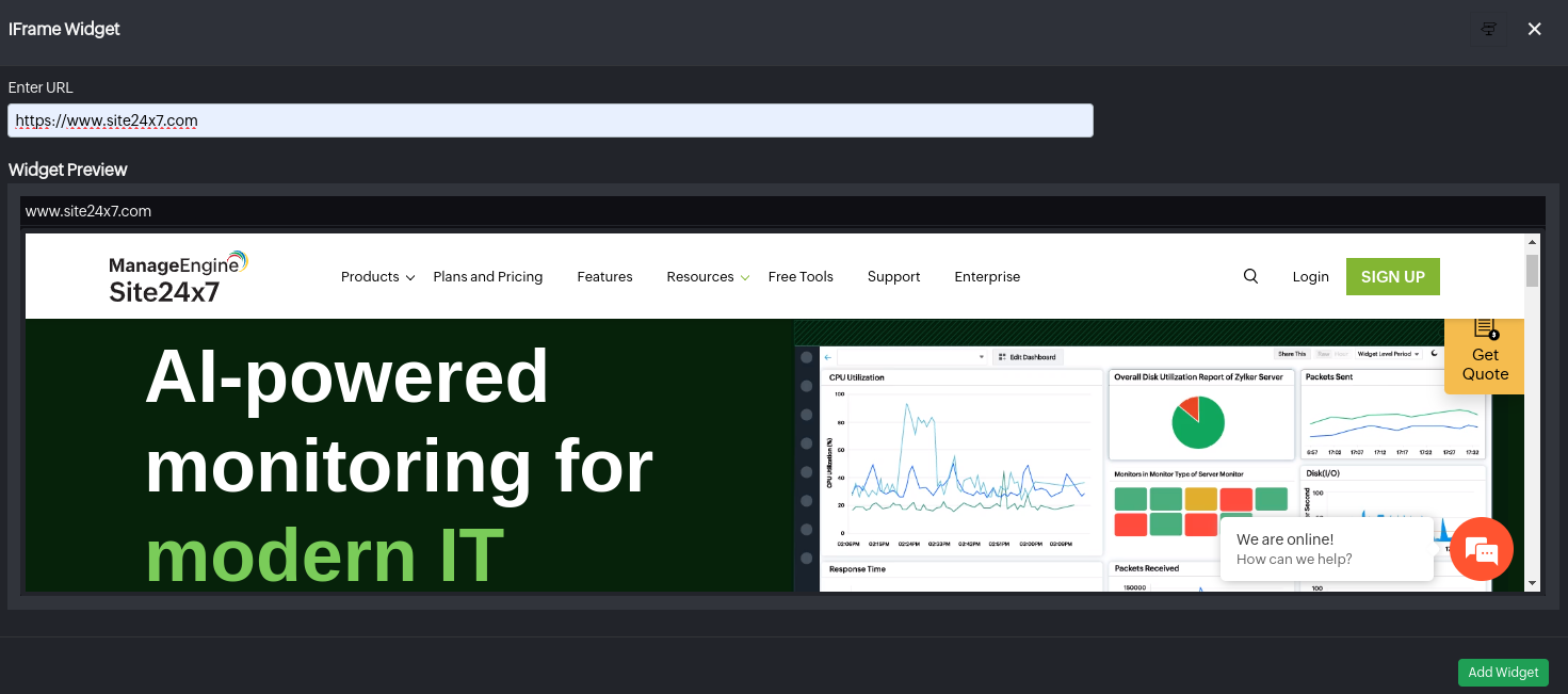
iFrame
The iFrame Widget lets you showcase any Site24x7 or third-party URLs or permalinks inside a widget. If you want to import and share your reports from your third-party reporting and analytics tool into Site24x7, you just have to paste the URL of that report in the URL field.
Note
Evaluation/Free users can add and view the widget only when they have an active web session. Otherwise, the iFrame widget will be disabled in public view. You must upgrade to a paid subscription plan to view the iFrame widget again.
Date & Time
You can select the Date & Time Widget to set up and view the current date and time at your preferred time zone. You can manually pick the required time zone by applying the filter. You can also tag a City/Region name to the selected time zone.
- Time Zone: Choose your desired time zone.
- Hour Format: You can choose between 12 hour or 24 hour format.
- City/Region Name: Select the applicable region.
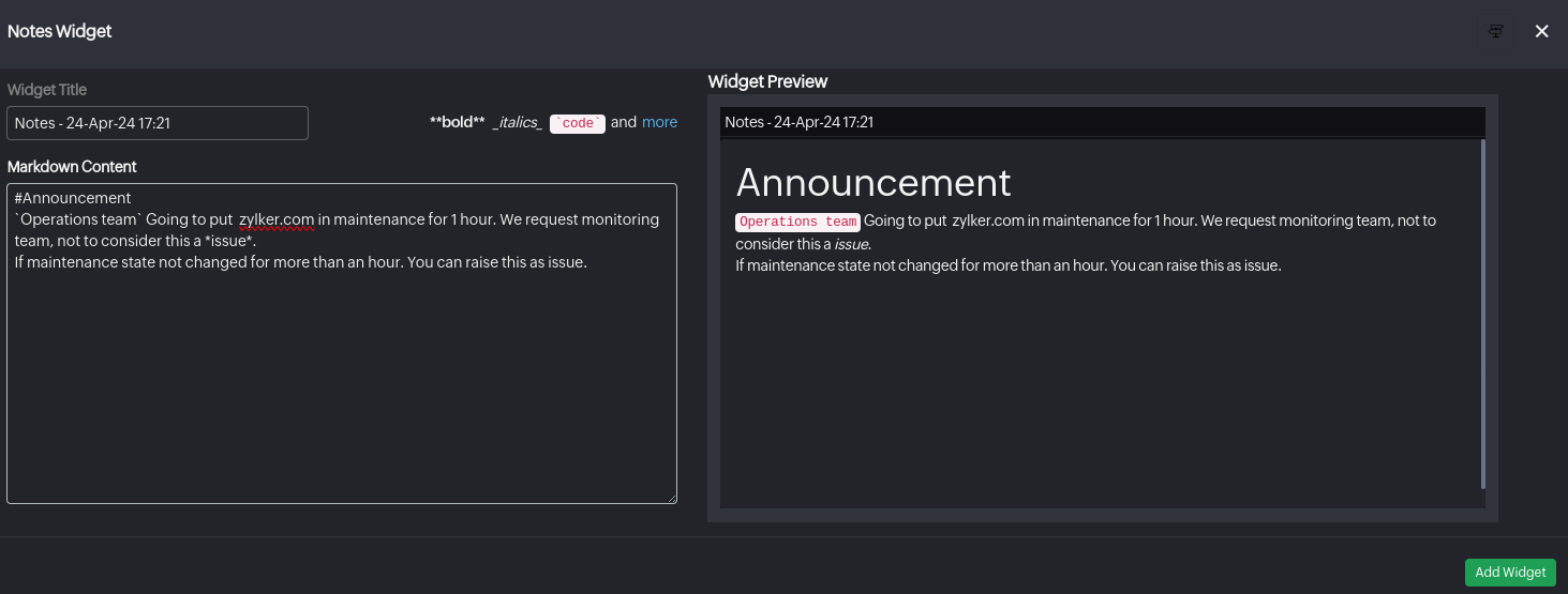
Notes Widget
The Notes Widget serves as a convenient tool for keeping essential information accessible on your dashboard to facilitating communication. It ensures vital messages and updates are easily communicated and referenced, enhancing overall dashboard usability and collaboration. You can refer to the markdown cheat sheet for markdown syntax while adding monitor inventory notes.
Advanced Analytics
Gain deeper insights with advanced analytics widget for comprehensive data analysis.
AppLogs
Gain deeper operational insights and streamline troubleshooting by incorporating a variety of AppLogs widgets into your Site24x7 dashboard to visualize, analyze, and save your log searches. You can add the following widgets to your dashboard:
| Widget | Description |
|---|---|
| AppLogs Graph Widget | Displays log trends over time using interactive charts. |
| AppLogs Number Widget | Displays key numerical insights such as total request counts or error occurrences, at a glance. |
| AppLogs Table Widget | Displays detailed log data in a structured table view for deeper analysis. |
| AppLogs KPI Widget | Displays essential performance indicators from your logs to monitor system health and efficiency. |
| AppLogs Alerts Status Widget | Displays log alert statuses through color-coded tiles representing severity levels like Critical, Trouble, or Up. |
AppLogs Graph Widget
Visualize log data trends through dynamic charts, making it clear and easy to identify anomaly patterns at a glance.

Log Type: Select the log type to be displayed in this widget.
Saved Search: Select your pre-saved search to visualize your most frequently used queries.
AppLogs Number Widget
Displays a single real-time aggregate value such as total request or error count in bold, at-a-glance, and ready-to-view format.

Conditional Formatting: Define conditions and specify custom metric values to render the widget data in green, orange, or red. Once the data breaches any conditions, the corresponding color will be applied to the data.
AppLogs Table Widget
Visualize your saved log data in a structured table view, and scan and view individual log events precisely.

AppLogs KPI Widget
Visualize your KPI (Key Performance Indicator) based on your saved search: time compare, response time, error rate, etc. By extracting and analyzing relevant KPIs from your selected log type.

AppLogs Alerts Status Widget
The AppLogs Alerts Status Widget provides a quick overview of all AppLog alerts, displaying each as a color-coded tile based on its severity.

Network
The Network section in Site24x7’s custom dashboards provides a suite of visualization tools to monitor your network’s performance, availability, traffic distribution, and topology. These widgets deliver both real-time and historical insights, helping network administrators detect anomalies, analyze configuration trends, and optimize infrastructure health.
Available widgets
| Widget | Description |
| Interfaces Health | Displays the overall health status of network interfaces using color-coded indicators. Useful for quickly identifying problematic or degraded interfaces. |
| Devices Down | Displays the total number of network devices that are currently unreachable due to outages, configuration issues, and the like. Ideal for quickly assessing the extent of connectivity problems across your environment. |
| Interfaces Down | Displays the number of interfaces that are currently in a Down or Administratively Down state. Helpful for pinpointing link failures, disabled ports, or cable issues affecting network performance. |
| Top-N Interfaces | Displays the top or bottom N interfaces based on metrics such as traffic volume, bandwidth usage, and interface utilization—ideal for spotting traffic spikes or bottlenecks. |
| Layer 2 Map | Maps out Layer 2 interconnections, showing port-to-port connectivity between switches and connected devices, aiding in detailed link-level troubleshooting. |
| Topology Map | Provides a high-level view of your network's topology, visually representing how devices are connected and updating in real time to reflect status changes. |
| Infrastructure Map | Shows the complete infrastructure layout for a holistic view of network components and their status. |
| NCM Summary | Summarizes activities for Site24x7 Network Configuration Manager (NCM), including backup status, configuration conflicts, compliance checks, and firmware vulnerabilities. |
| NCM Vulnerabilities | Displays detailed vulnerability data—such as the number of affected devices, vulnerability age, and severity levels—as identified via configuration audits. |
| NCM Widgets | Allows you to create tabular views of specific NCM metrics such as device configuration status, compliance violations, or policy changes. |
| Configuration Change Trend | Visualizes configuration changes across your devices over time, enabling you to track, audit, and respond to both authorized and unauthorized changes. |
| NetFlow - Flow Type | Breaks down traffic by supported flow technologies (NetFlow, sFlow, J-Flow, IPFIX, NetStream, AppFlow), helping to categorize traffic by type and protocol. |
| NetFlow Widgets | Provides in-depth NetFlow-based insights including top conversations, application-level usage, QoS distribution, and source/destination IP analysis per device or interface. |
| Interface Performance | Monitor real-time network interface metrics to optimize performance and quickly identify issues. |
| Network Tree | View a hierarchical map of network categories and monitor statuses, using color and count indicators to quickly assess device health at a glance. |
| Device with Alarms | Track outages for specific devices to identify recurring issues and prioritize troubleshooting effectively. |
| SNMP Trap Alarms | Monitor SNMP trap alarms to quickly troubleshoot device failures and maintain stable network connectivity. |
| Alarms for Device | List devices in alarm state with detailed reasons and durations to accelerate root cause analysis, reduce downtime, and enhance reliability. |
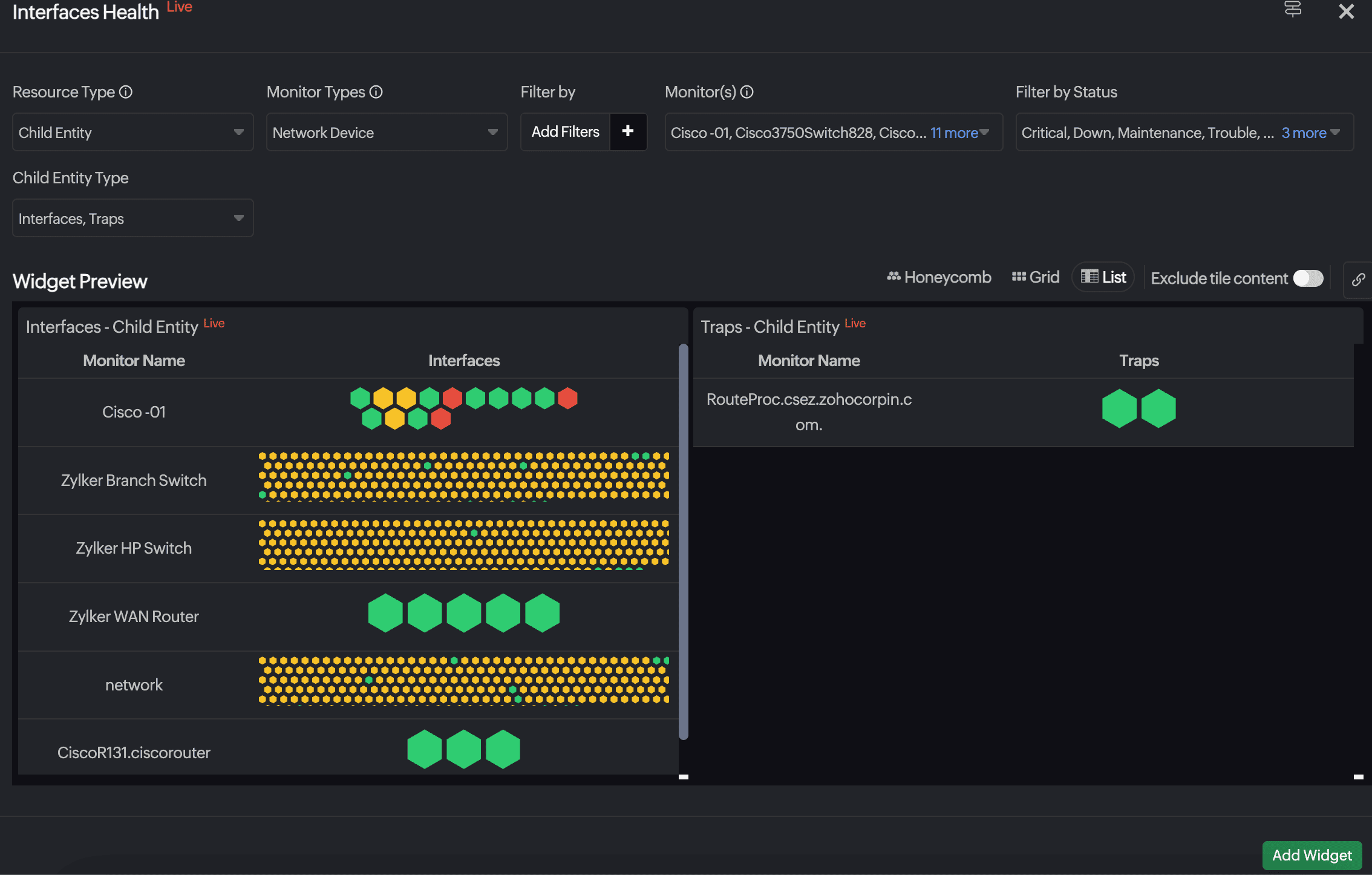
Interfaces Health
Gain a consolidated NOC view of the health status of all monitored network interfaces. Identify degraded or unstable interfaces instantly, and monitor operational status to ensure optimal network reliability.
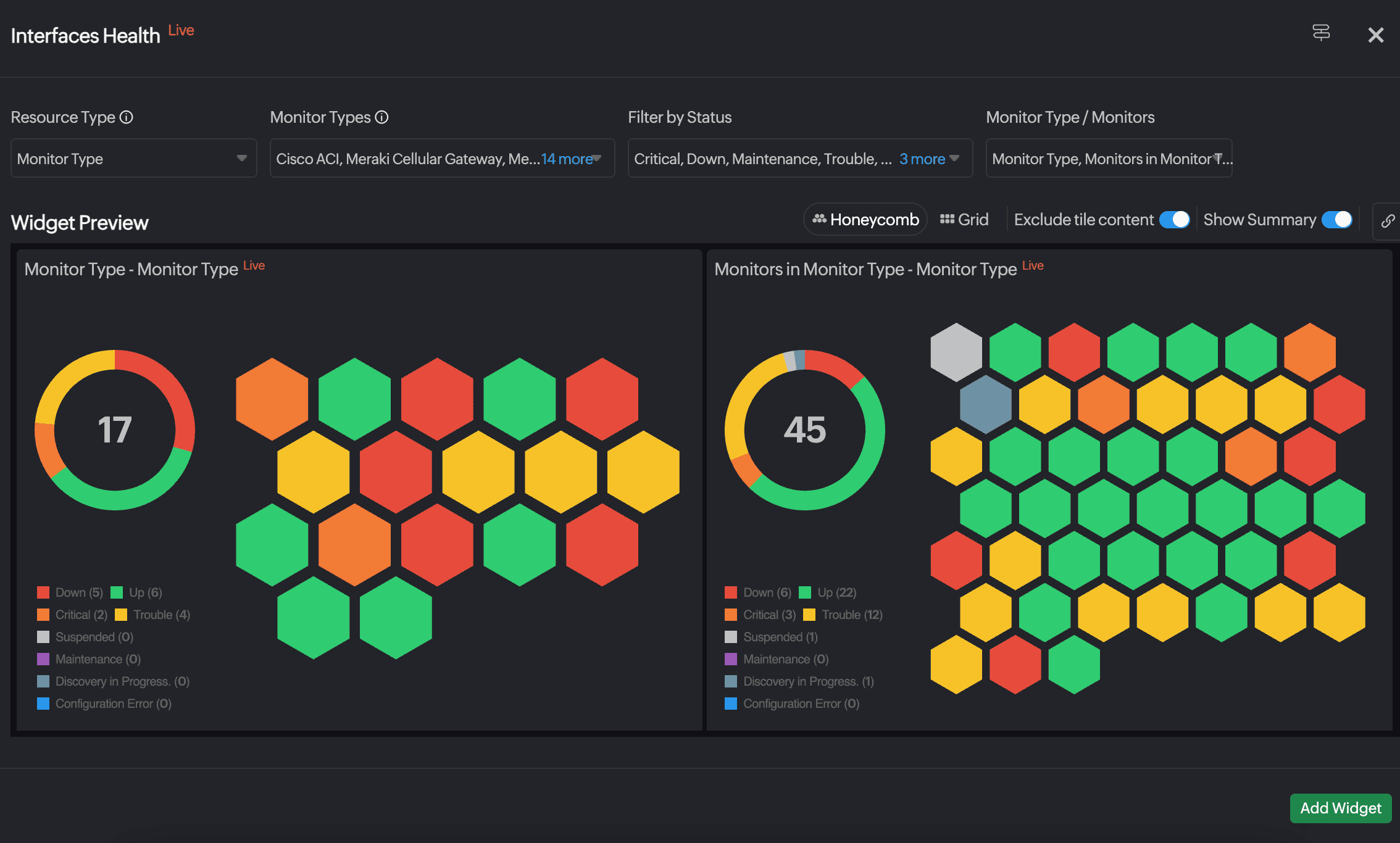
- Resource Type: Choose from All Monitors, Monitor, Monitor Group, Monitor Type, Child Entity, or Tags.
- Monitor Type(s): Choose a desired monitor type. To view Interfaces Health, you can choose from Network Device, VeloCloud Edge, Cisco ACI, or NetFlow Device.
- Filter by: Filter the resources based on the Status, Monitor Groups, or Tags based on your selection for the Resource Type field.
- Monitor(s), Monitor Group, Groups / Monitors, Tags / Monitors, Child Entities: Select the required monitors, groups, tags, or child entities. The field name will vary based on the selection for Resource Type.
- Child Entity Type: This will be visible if the Resource Type is Child Entity. Select from Interfaces or Traps to view the respective child entities, if you have selected Network Device in Monitor Types. If you have selected VeloCloud Edges, Links will be displayed in Child Entity Type. For all the other options, Interfaces will be displayed.
Additionally, you can select the preferred layout from Honeycomb, Grid, or List views. You can also use the Exclude tile content toggle to exclude the data from the tiles. - Show Summary: Toggle to view the number of monitors based on status along with their details in a doughnut chart. The doughnut chart displays the total number of resources. Use the legend to toggle monitors in the widget and doughnut chart. For instance, clicking Down in the legend hides Down monitors, showing only the remaining monitors.
The List view is available only for resource types categorized as Child Entity.
Devices Down
Consolidate all resources that are in the Down state into a tabular view. Additionally, you can understand the reasons for their outages and the duration of their states, ensuring prompt identification and resolution of issues to maintain operational stability.
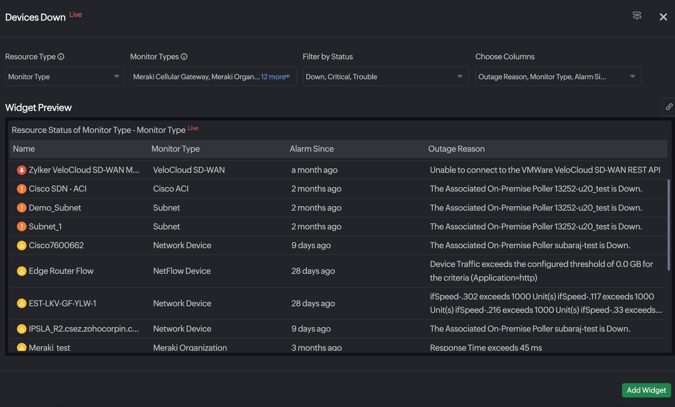
- Resource Type: Select from All Monitors, Monitor, Monitor Groups, Monitor Type, Child Entity, and Tags.
- Monitor(s), Monitor Group, Monitor Types, Tag or Child Entities: Select the required monitors, groups, types, tags or child entities. The field name will vary based on the selection for Resource Type.
- Include Subgroups: When the Resource Type is Monitor Group, details for monitors within this monitor group are displayed. You can also choose to include or exclude subgroups by toggling this option.
- Child Entity Type: When the Resource Type is Child Entity, only monitor types with child entities are listed in the Monitor Type field. Select from Interfaces or Traps to view the respective child entities, if you have selected Network Device in Monitor Types. If you have selected VeloCloud Edges, Links will be displayed in Child Entity Type. For all the other options, Interfaces will be displayed.
- Filter by: Filter the resources based on the Status, Monitor Groups, or Tags based on your selection for the Resource Type field.
- Choose Columns: Select the desired columns from Outages Reason, Monitor Type, and Alarm Since. If the Resource Type is Child Entity, you can select Parent Monitor Type.
Interfaces Down
Display a tabular view of all the interfaces that are currently down across your network. This will help you understand the duration and root cause of each interface's downtime to help reduce mean time to resolution (MTTR) and improve network resilience.
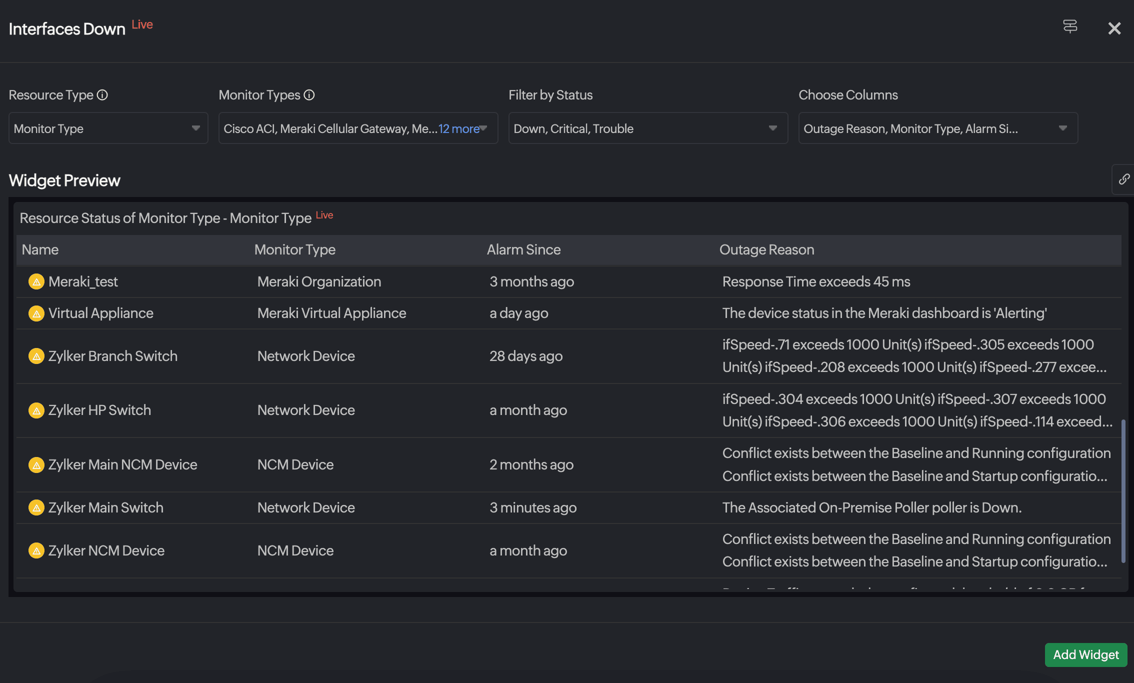
- Resource Type: Select from All Monitors, Monitor, Monitor Groups, Monitor Type, Child Entity, and Tags.
- Monitor(s), Monitor Group, Monitor Types, Tag, or Child Entities: Select the required monitors, groups, types, tags or child entities. The field name will vary based on the selection for Resource Type.
- Include Subgroups: When the Resource Type is Monitor Group, details for monitors within this monitor group are displayed. You can also choose to include or exclude subgroups by toggling this option.
- Child Entity Type: When the Resource Type is Child Entity, only monitor types with child entities are listed in the Monitor Type field. Select from Interfaces or Traps to view the respective child entities, if you have selected Network Device in Monitor Types. If you have selected VeloCloud Edges, Links will be displayed in Child Entity Type. For all the other options, Interfaces will be displayed.
- Filter by: Filter the resources based on the Status, Monitor Groups, or Tags based on your selection for the Resource Type field.
- Choose Columns: Select the desired columns from Outages Reason, Monitor Type, and Alarm Since. If the Resource Type is Child Entity, you can select Parent Monitor Type.
Top-N Interfaces
Visualize the top-performing interfaces based on traffic, utilization, or errors. Easily pinpoint overutilized or underperforming interfaces and make informed decisions on load balancing, upgrades, or maintenance.
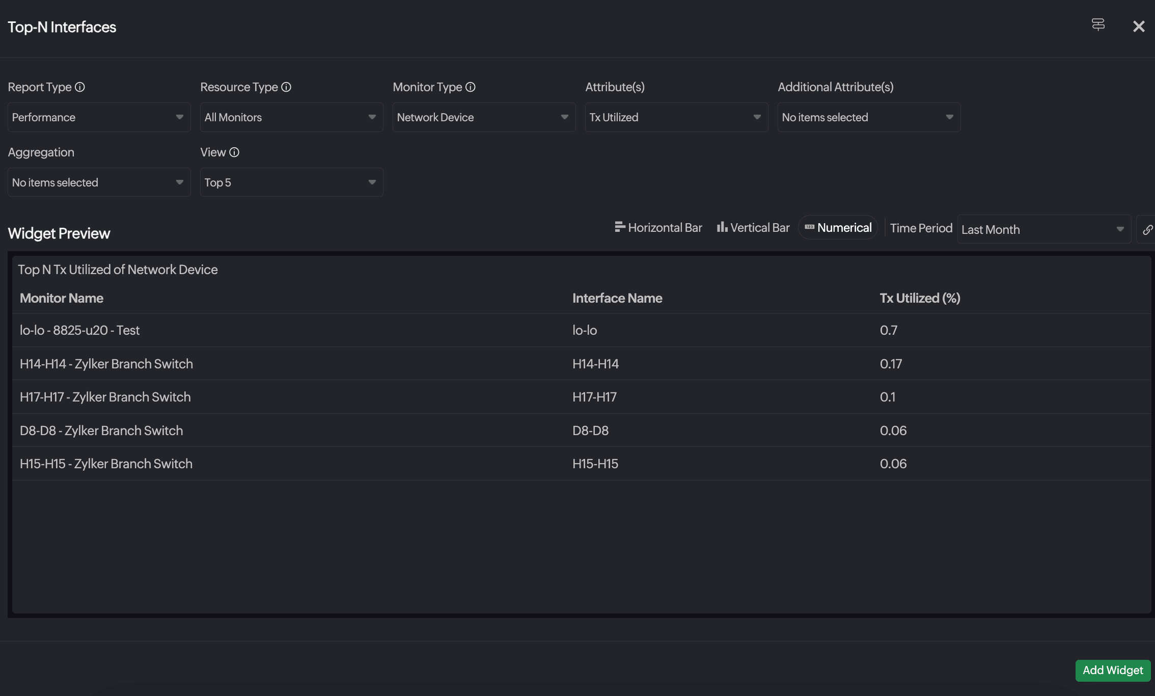
- Report Type: Selected as Performance by default.
- Resource Type: Select All Monitors, Monitor, or Monitor Group.
- Monitor Type: Select as Network Device by default.
- Monitor Groups: Select your desired monitor group, if the Resource Type is Monitor Group.
- Attributes: Select your desired attributes. The following are the options available for interfaces:
- Total Volume
- Out Traffic
- Out Discards
- In Discards
- Total Traffic
- In Errors
- Rx Volume
- Out Errors
- In Traffic
- Rx Utilized
- Tx Utilized
- Tx Volume
- Additional Attribute(s): You can select additional attributes for each attribute that you select.
- View: Select one from the following options:
- Top 5
- Top 10
- Top 20
- Top 25
- Bottom 5
- Bottom 10
- Bottom 20
- Bottom 25
You can choose to view the data as a horizontal bar, vertical bar, or as numerical values over a specific time period.
Layer 2 Map
Generate a real-time visual representation of your Layer 2 network topology. With this, you can understand the physical connectivity between switches, routers, and interfaces, making it easier to troubleshoot link failures and port-level issues.
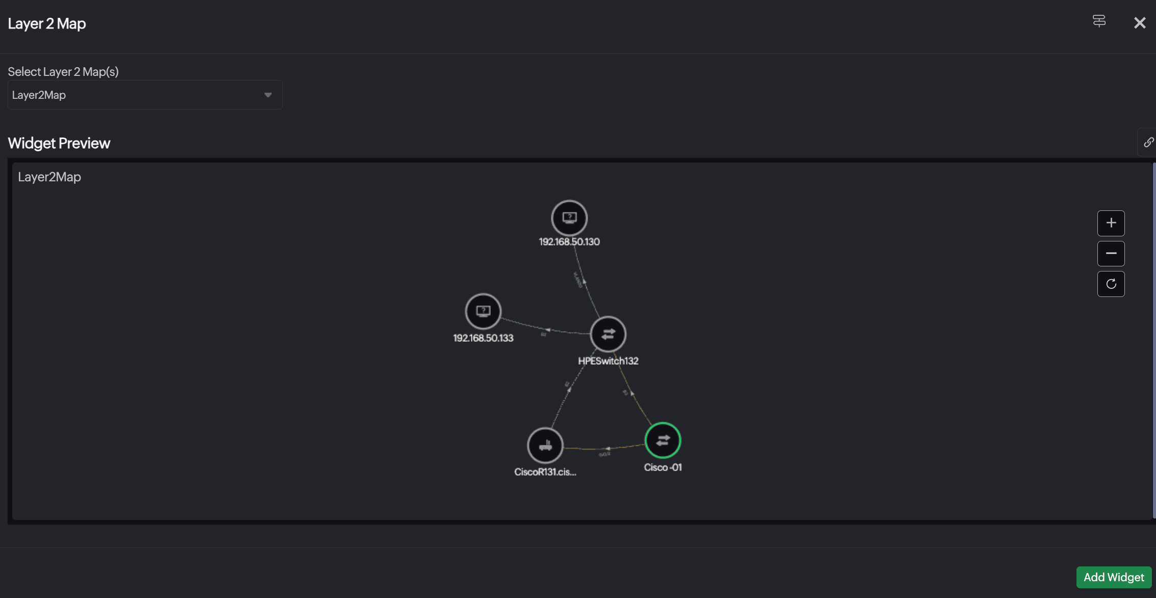
Select Layer 2 Map(s): Select an already created Layer 2 map. You can zoom in, zoom out, or refresh the map by using the controls present on the right side of the map.
Topology Map
View your entire network topology with device interconnections, traffic paths, and device statuses. This high-level visualization helps in identifying bottlenecks, misconfigurations, and dependencies in real time.
Select Topology Map(s): Select an already created topology map. You can zoom in, zoom out, or refresh the map by using the controls present on the right side of the map.
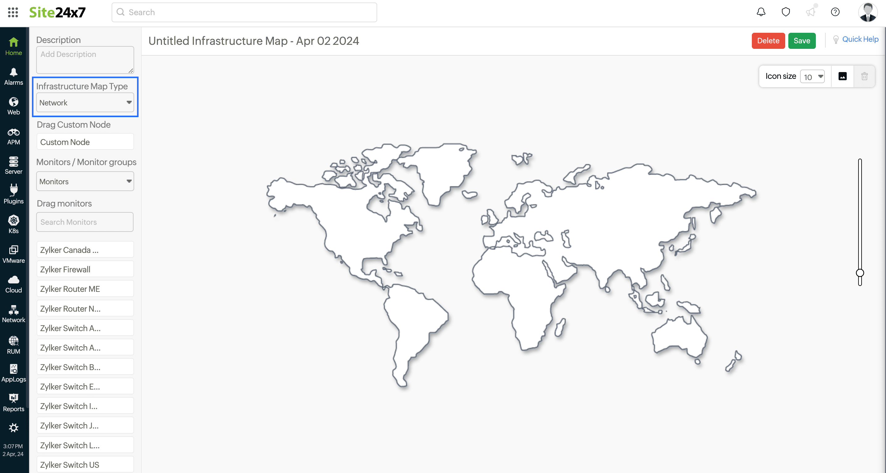
Infrastructure Map
Gain a centralized graphical view of your entire network infrastructure, including device roles, status, and relationships. Monitor the availability and health of critical components at a glance and drill down for detailed insights.
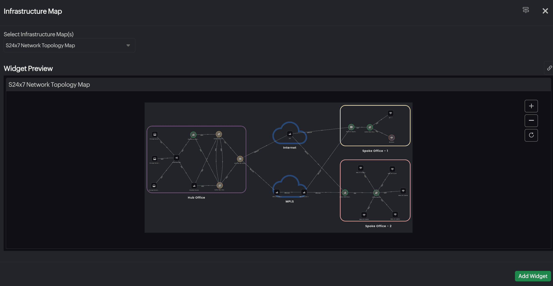
Select Infrastructure Map(s): Select an already created infrastructure map. You can zoom in, zoom out, or refresh the map by using the controls present on the right side of the map.
NCM Summary
Access a summarized view of NCM data, including compliance status, backup status, and configuration drifts. Ensure network integrity by tracking changes and identifying unauthorized modifications.
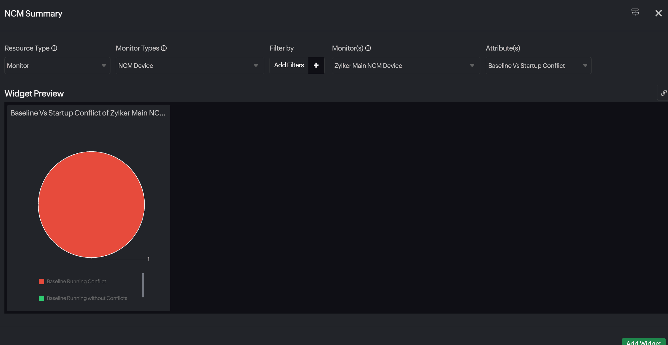
- Resource Type: Select All Monitors, Monitor Group, Monitor Type, or Tags.
- Monitor Types: Displayed based on selection for Resource Type. Selected as NCM Device by default.
- Include Subgroups: When the Resource Type is Monitor Group, details for monitors within this monitor group are displayed. You can also choose to include or exclude subgroups by selecting the appropriate option from the drop-down menu.
- Filter by: Filter the resources based on Monitor Groups or Tags based on your selection for the Resource Type field.
- Monitor(s), Monitor Group, or Tag: Select values as needed. The field name will vary based on the selection for Resource Type.
- Attribute(s): Select an option from the drop-down menu. The following options are available.
- Baseline vs Running Conflict
- EOL
- Backup Status
- Compliance
- Startup Vs Running Conflict
- Baseline Vs Startup Conflict
- Vulnerability Severity
NCM Vulnerabilities
Identify configuration vulnerabilities and compliance violations across network devices. Use this widget to prioritize remediation efforts and strengthen your network’s security posture.
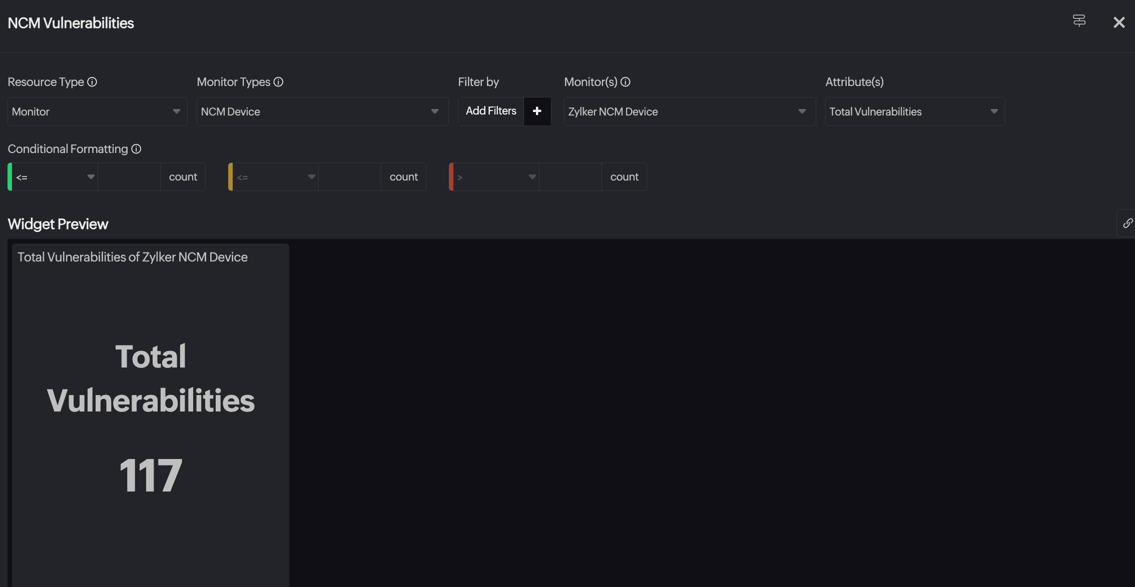
- Resource Type: Select All Monitors, Monitor Group, Monitor Type, or Tags.
- Monitor Types: Displayed based on selection for Resource Type. Selected as NCM Device by default.
- Include Subgroups: When the Resource Type is Monitor Group, details for monitors within this monitor group are displayed. You can also choose to include or exclude subgroups by selecting the appropriate option from the drop-down menu.
- Filter by: Filter the resources based on Monitor Groups or Tags based on your selection for the Resource Type field.
- Monitor(s), Monitor Group, or Tag: Select values as needed. The field name will vary based on the selection for Resource Type.
- Attribute(s): Select an option from the drop-down menu. The following options are available.
- Total Vulnerabilities
- Exploits Available
- Affected Devices
- Vulnerabilities Discovered
- Vulnerability Age Matrix
- Vulnerabilities Over Time
- Conditional Formatting: Define conditions and specify custom metric values to render the widget data in green, orange, or red to denote severity. Once the actual data breaches any of the conditions, the corresponding color is applied to the data.
NCM Widgets
View prebuilt widgets that represent NCM-specific metrics and data. These include backup statuses, end-of-life (EOL) details, and compliance summaries, helping streamline network configuration monitoring.
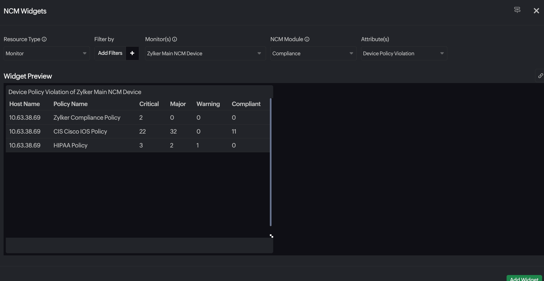
- Resource Type: Select All Monitors, Monitor Group, Monitor Type, or Tags.
- Include Subgroups: When the Resource Type is Monitor Group, details for monitors within this monitor group are displayed. You can also choose to include or exclude subgroups by selecting the appropriate option from the drop-down menu.
- Filter by: Filter the resources based on Monitor Groups or Tags based on your selection for the Resource Type field.
- Monitor(s), Monitor Group, or Tag: Select values as needed. The field name will vary based on the selection for Resource Type.
- NCM Module: Select any of these options from the drop-down menu:
- EOL
- Backup
- Configuration Changes
- Conflict Status
- Compliance
- Firmware Vulnerabilities
- Attribute(s): Select an option from the drop-down menu. The options vary based on selection for NCM Module.
Configuration Change Trend
Visualize trends in configuration changes over time. Track the frequency and timing of changes to detect unusual activity and maintain audit compliance across your network devices. 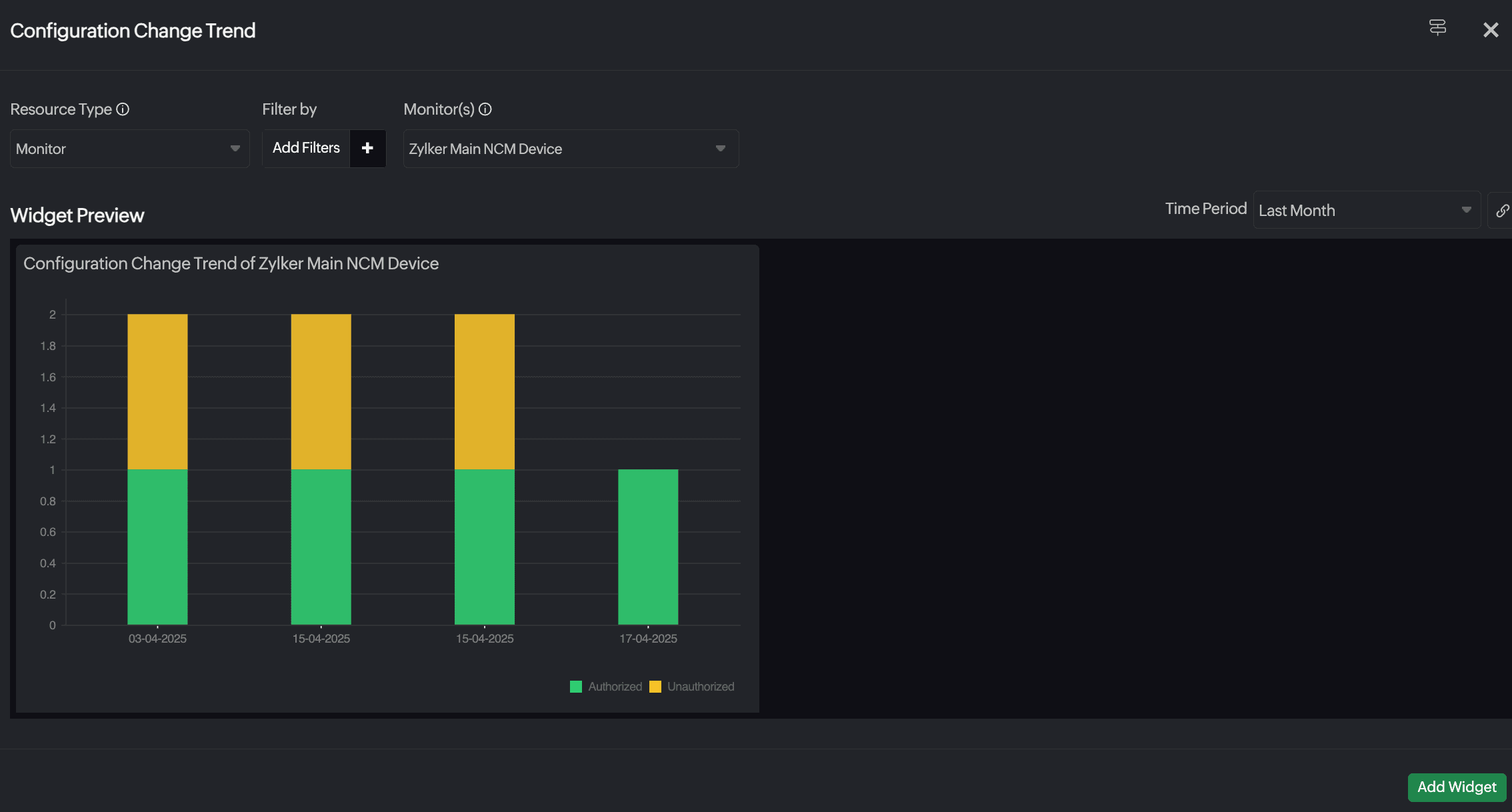
- Resource Type: Select All Monitors, Monitor Group, Monitor Type, or Tags.
- Include Subgroups: When the Resource Type is Monitor Group, details for monitors within this monitor group are displayed. You can also choose to include or exclude subgroups by selecting the appropriate option from the drop-down menu.
- Monitor(s), Monitor Group, or Tag: Select values as needed. The field name will vary based on the selection for Resource Type.
You can choose to view the data over a specific time period.
NetFlow - Flow Type
Analyze traffic flow types (NetFlow, AppFlow, etc.) using NetFlow data. Gain deep visibility into protocol distribution.
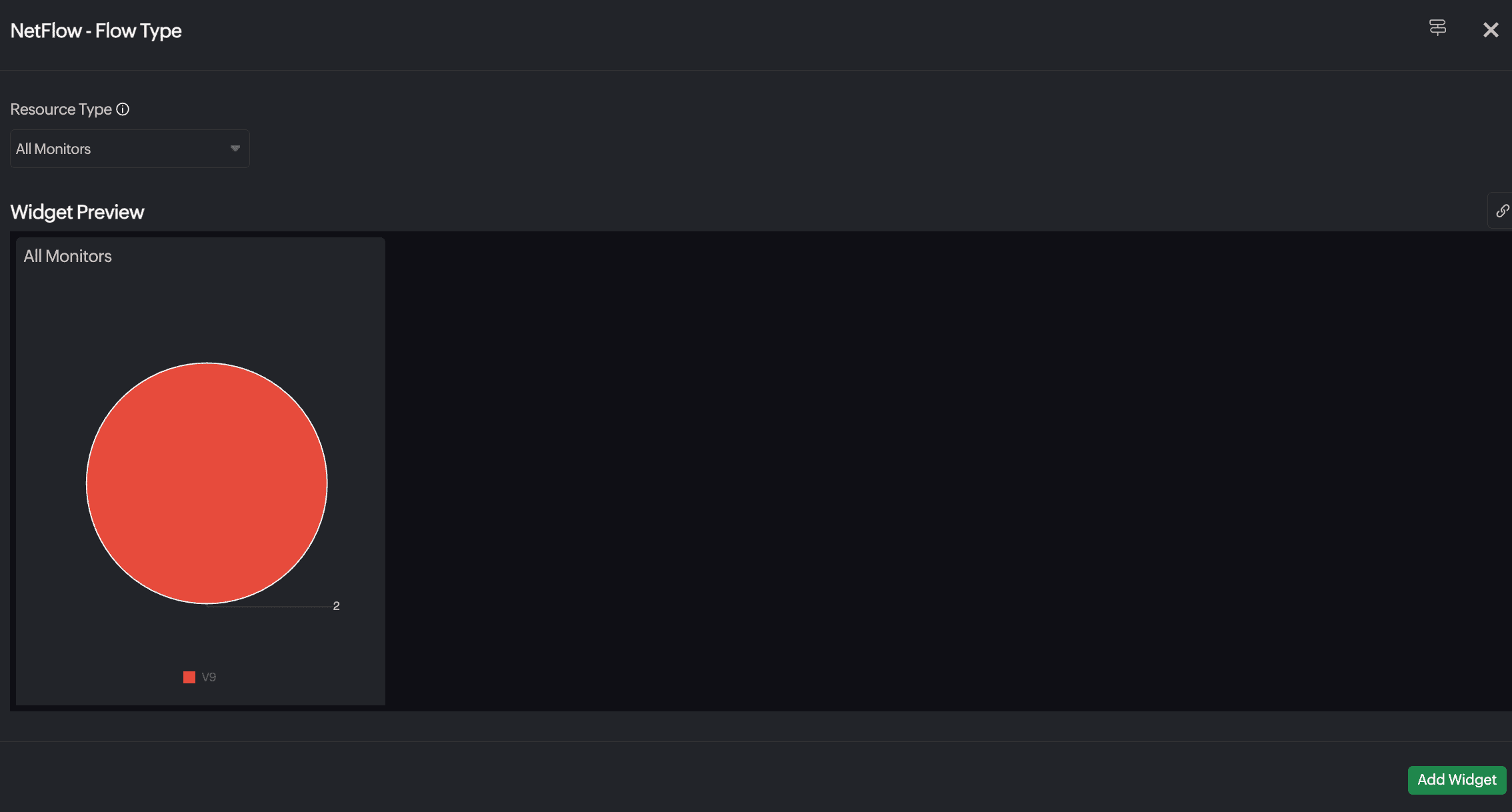
- Resource Type: Select All Monitors, Monitor Group, or Tags.
- Include Subgroups: When the Resource Type is Monitor Group, details for monitors within this monitor group are displayed. You can also choose to include or exclude subgroups by selecting the appropriate option from the drop-down menu.
- Monitor Group, or Tag: Select values as needed. The field name will vary based on the selection for Resource Type.
NetFlow Widgets
Access a collection of widgets that provide NetFlow-based analytics, including top talkers, conversations, protocols, and application-level insights.
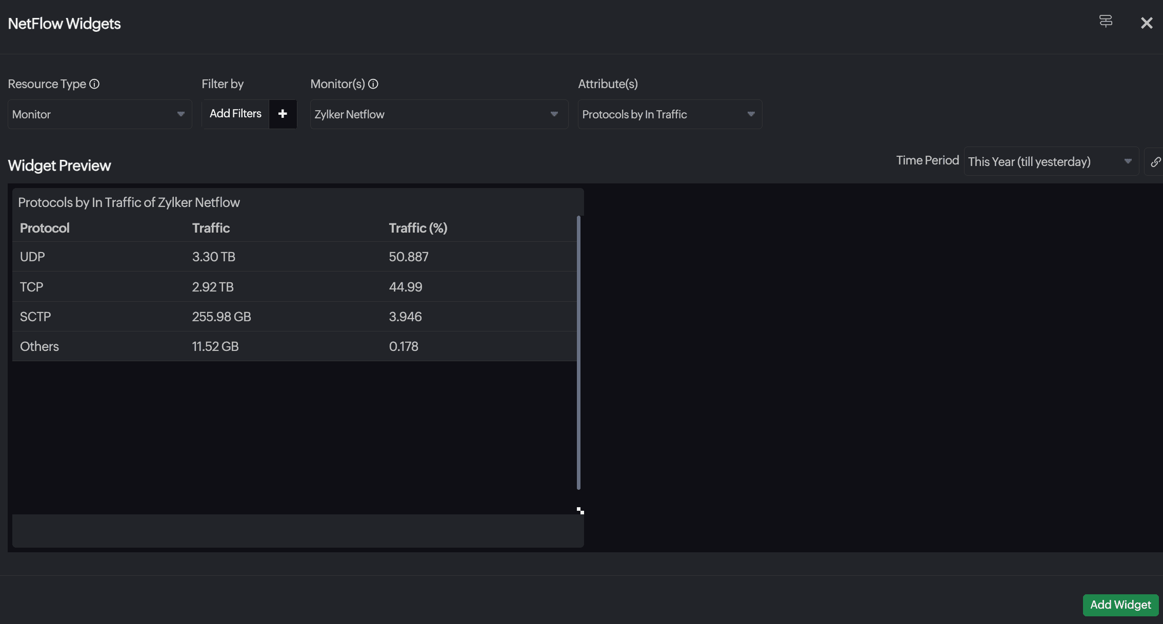
- Resource Type: Select Monitors, or Child Entity.
- Include Subgroups: When the Resource Type is Monitor Group, details for monitors within this monitor group are displayed. You can also choose to include or exclude subgroups by selecting the appropriate option from the drop-down menu.
- Filter by: Filter the resources based on Monitor Groups or Tags based on your selection for the Resource Type field.
- Monitor(s), Monitor Group, or Tag: Select values as needed. The field name will vary based on the selection for Resource Type.
- Attribute(s): Select an option for device or interface as needed:
- Applications by In Traffic
- Applications by Out Traffic
- Protocols by In Traffic
- Protocols by Out Traffic
- QoS by In Traffic
- QoS by Out Traffic
- Destination IP by In Traffic
- Destination IP by Out Traffic
- Source IP by In Traffic
- Source IP by Out Traffic
- Conversation by Traffic
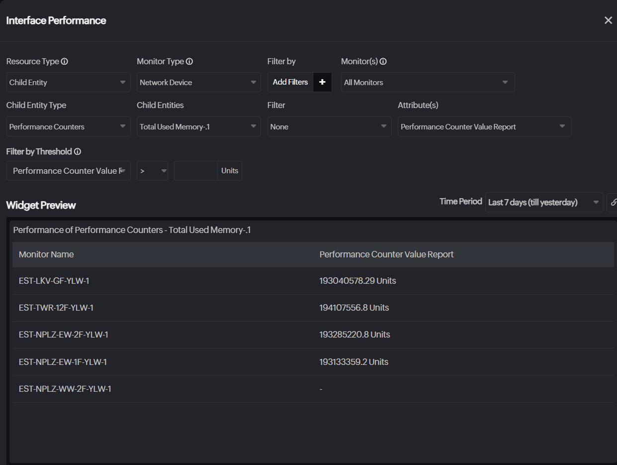
Interface Performance
Monitor interface health and optimize network performance with the Interface Performance widget. This widget is based on the Performance Attribute - Table widget, so most configurations are prefilled. Select the desired interface and attributes to initiate monitoring performance.
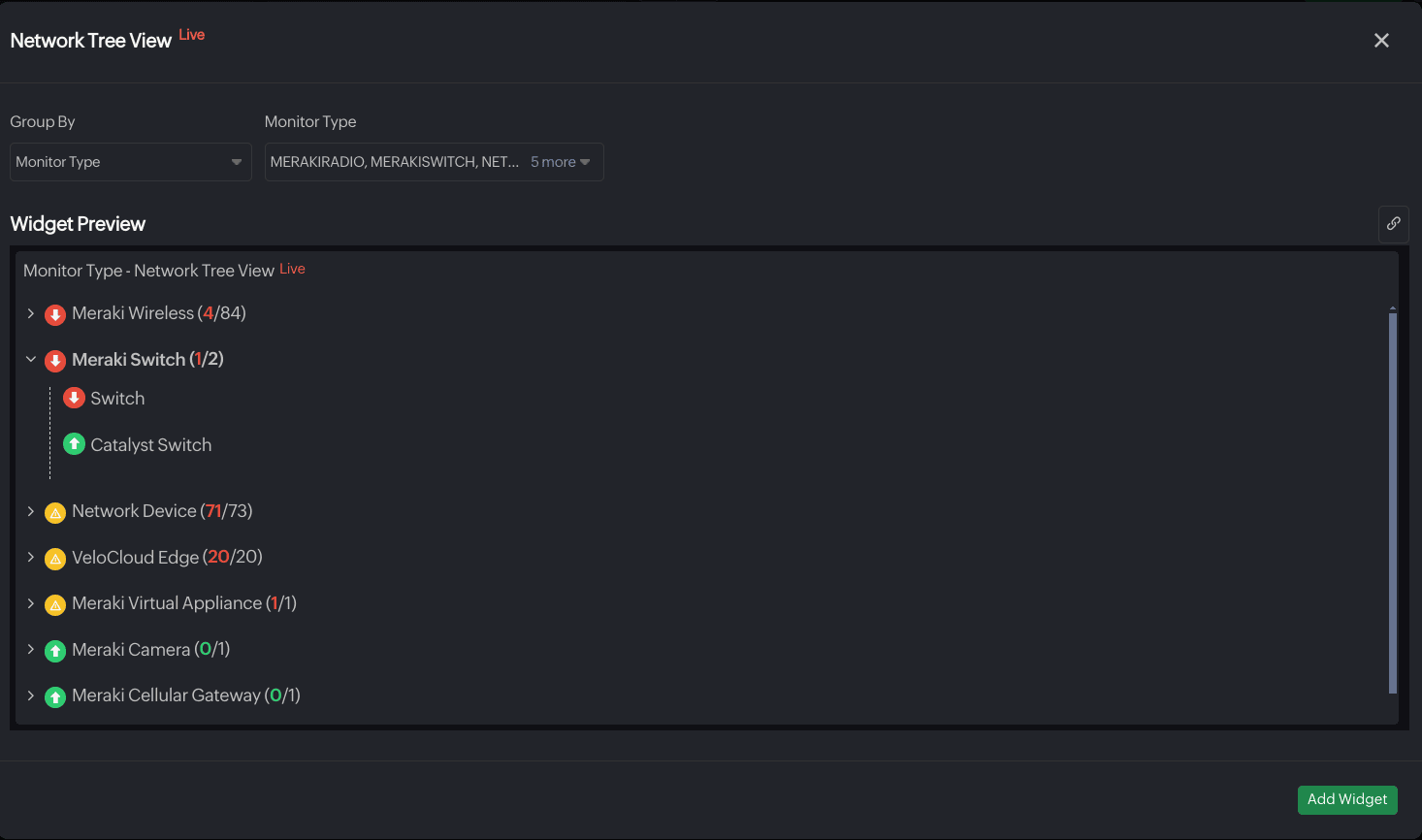
Network Tree
Obtain a tree view of different network categories and their respective monitors along with their status. View the fraction of devices that are in Down, Trouble, and Critical state adjacent to the resource name.
- Group By: Select the category based on which you want to group the resources.
- Category: Select the resources to obtain their tree view.
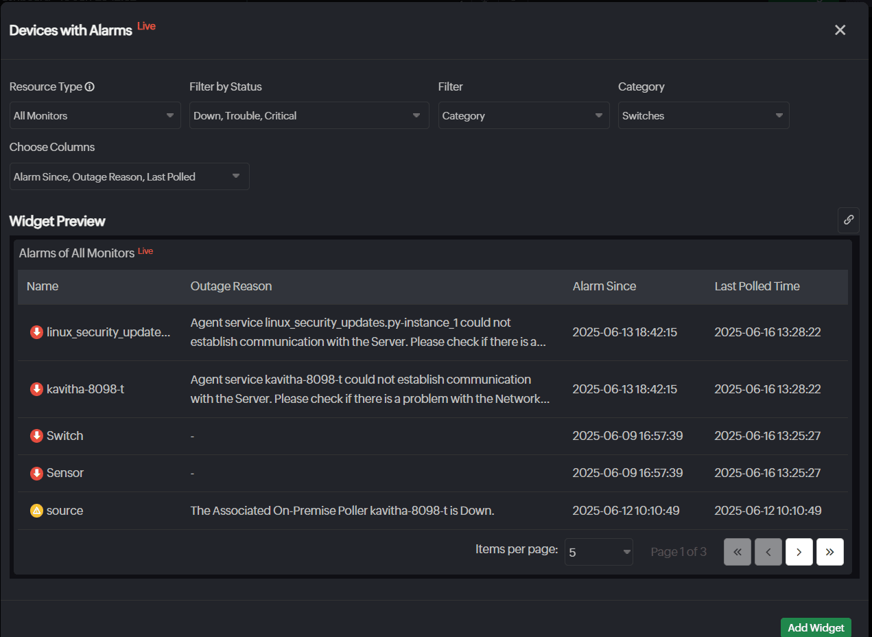
Device with Alarms
Drill down the details of the devices with alarms to know the reason and duration of their downtime.
- Resource Types: Select from Monitor, Monitor Group, Monitor Type, Child Entity, and Tags. Further, you can select the resources based on the selected resource type.
- Filter: Filter further to select resources based on category.
- Category: Select resources based on categories like Wireless, Server, Routers, and more.
- Filter by Status: Filter resources based on Down, Trouble, or Critical state.
- Filter By: Select resources based on Monitor Type, Monitor Groups, or Tags.
- Choose Column: Select columns to show resource and alarm details like Name along with status, Alarm Since, Outage Reason, Last Polled, Monitor Type, Monitor Groups, Tags, and Technician.
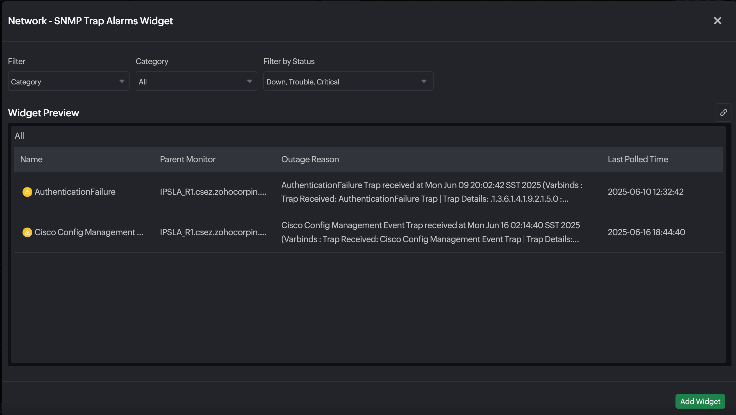
SNMP Trap Alarms
Gain a segregated view of alarms from SNMP traps with the SNMP Trap Alarms widget and gain insights into critical network events. Ensure uninterrupted connectivity by troubleshooting device malfunctions promptly.
- Resource Type: Select the resources based on Category, Monitor Group, or Tags.
- Filter by Status: Filter the resources based on Down, Trouble, and Critical states.
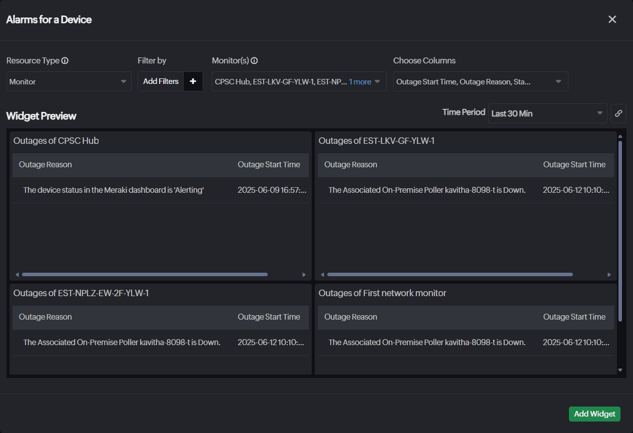
Alarms for Device
View the complete outage history of individual network devices to monitor their performance and operational status over time. The device-specific alarm view consolidates all related alerts on a single page, enabling faster issue resolution, reduced downtime, and improved network reliability.
- Resource Type: Select the desired resource type.
- Filter by: Filter the resources based on Monitor Type, Monitor Group, or Tags.
- Monitor(s): Select the resources for which you want the alarm details.
- Choose Columns: Select columns to show more alarm details like Outage Start Time, Outage Reason, Technician, Status, and Duration.
SLO
Time Series
This widget visualizes performance metrics for SLOs over specific time intervals. It is useful for tracking and analyzing metrics like attributes and service-level indicators (SLIs) during a defined period.
- SLO: Choose your desired SLO.
- Metrics: Select key metrics for the SLO, which include the attributes or SLIs of the chosen SLO.
- Attributes: Choose the attributes of the SLO, including Burn Rate, Error Budget Consumed, Error Time Left, and SLO.

-
SLI Lists: Select the SLIs associated with the SLO.
 Note
NoteWhen more than one SLOs are selected, only the SLI Lists option will be available.
Numeric
The Numeric widget offers a straightforward way to view performance metrics and attributes in numeric format.
- SLO: Choose your desired SLO.

Additional features
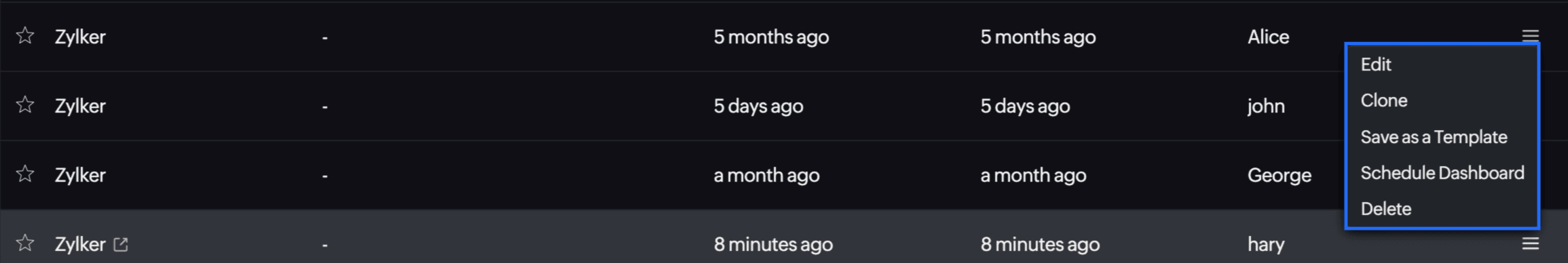
Users with custom roles can use the View My Resources option to filter and view resources they created. Under the Custom Dashboards tab, from the hamburger icon in your dashboard listing, you can access the following features.
- You can Clone your custom dashboard to quickly replicate widget selections and create consistent monitoring setups across your entire infrastructure.
- You can search within individual columns and export the widget data.
- You can use the Save as a Template feature in Site24x7 to quickly replicate consistent dashboards across multiple clients, ensuring uniformity and saving time. This streamlines the dashboard customization process across monitors and monitor groups, eliminating the need to create new dashboards from scratch.
- Accommodate more widgets in the dashboard with the widget-dragging feature. Simply drag a widget beyond the dashboard boundaries to expand your workspace automatically. The dashboard will continue to enlarge as you drag, allowing you to add more widgets without being limited by the initial size.
- You can select multiple widgets by holding CTRL (on LINUX and Windows systems) or Command (on Mac systems) and clicking on the desired widgets. When multiple widgets are selected, you can Clone, Delete, and Move to Widget Group by right-clicking on any of the selected widgets.
For MSP customers, it's recommended to consolidate customer data into a single dashboard for easy access.
- Use the Schedule Dashboard feature to automate the generation and distribution of your dashboard as a PDF at specified intervals.
- From here, you can also choose to Edit or Delete the dashboard.
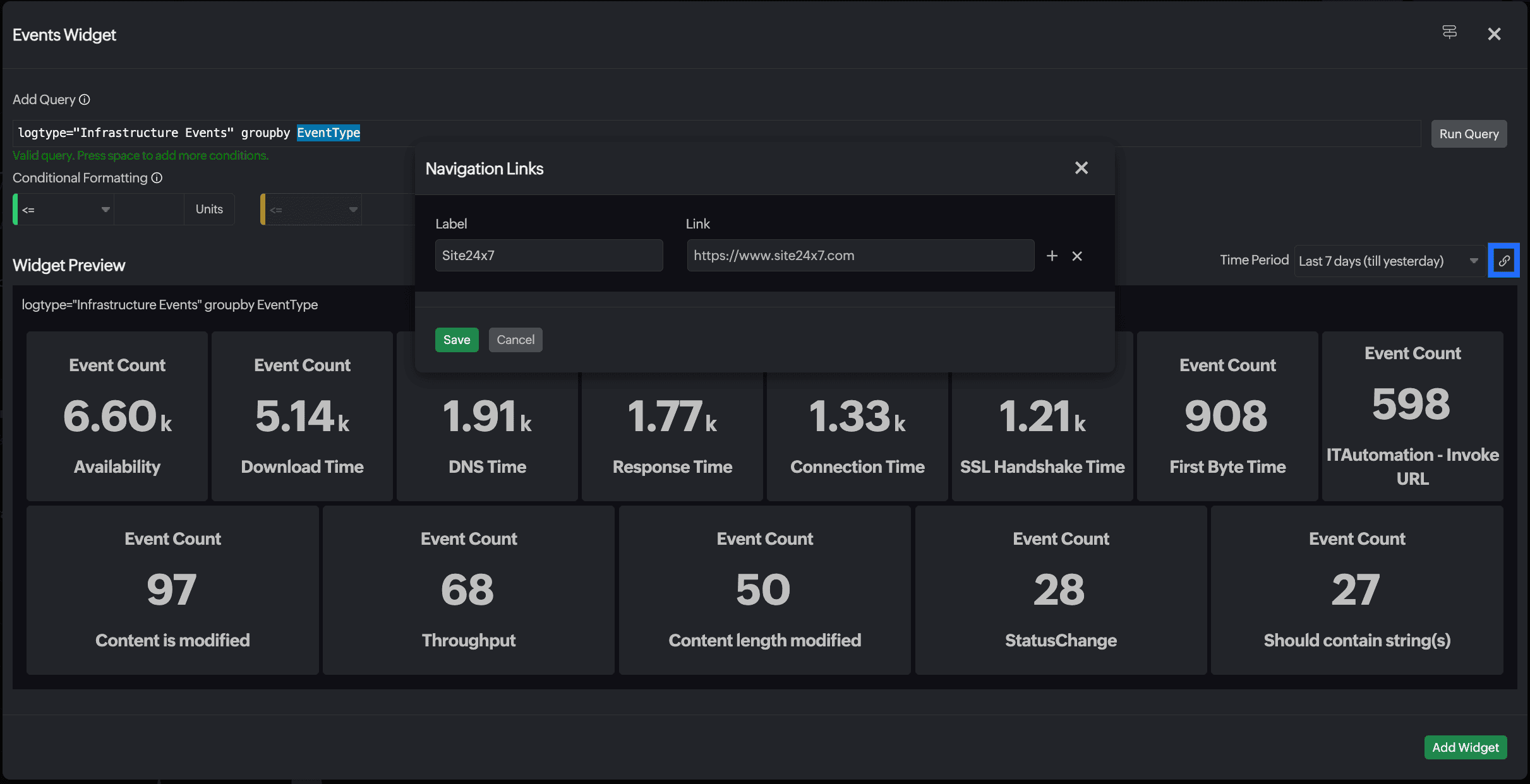
Navigation Links
Connect dashboard widgets with relevant pages in Site24x7 and other external links using Navigation Links to enable easier navigation and faster troubleshooting and debugging.
Click the link icon ![]() in the upper-right corner to configure up to 10 links per widget. Access these links by right-clicking the widget in the dashboard.
in the upper-right corner to configure up to 10 links per widget. Access these links by right-clicking the widget in the dashboard.